Best Scrollytelling Examples: Web Designs and Inspiration
Author note: This article was written by a human author. No generative AI was used to draft the text. AI tools, if any, were limited to spelling or formatting assistance.
What is scrollytelling?
Scrollytelling (a blend of scroll and storytelling) is a web design technique where the narrative unfolds as the user scrolls the website. The first examples of scrollytelling started appearing on the web over a decade ago, with well-known pieces like The New York Times' Snow Fall: The Avalanche at Tunnel Creek.
Scrollytelling helps tell a story in an immersive way, instead of writing text enriched with images and maybe video embeds. It feels like the reader "controls" the page and is part of the story, helping grab and keep attention when you have 50 milliseconds to make a good first impression.
There are 3 main key things about scrollytelling:
- Pacing ("Remote Control") - The reader is in control of how they read. If they scroll fast, the story moves fast; if they stop, the story freezes. This gives total control over complex information.
- Triggered Animation - Unlike traditional websites where things just render, in scrollytelling, elements "activate" when they reach a certain point on the screen. A chart might draw itself, a background might transform from a forest to a city, or a video starts playing automatically when it reaches the center of the page.
- The "Reveal" Mechanic - Information is served in bite-sized chunks. It prevents content fatigue (when the reader feels overwhelmed by a wall of text) by only showing what the reader needs at that exact moment.
You can read more about what scrollytelling is in our article about scrollytelling, explore our complete guide to the best scrollytelling tools and digital storytelling platforms, or study curated feature writing examples to see how professional journalists structure compelling narratives.
27 scrollytelling examples to inspire your content
Scroll-based visual storytelling, packed with interactive elements, significantly boosts visitor engagement. When executed correctly, these digital stories perform exceptionally well from an SEO perspective.
Key SEO considerations for scrollytelling:
- Dwell Time: Scrollytelling websites typically see higher dwell times and longer average engagement. This naturally reduces bounce rates - a major signal that tells Google and other search engines to rank a website higher.
- Speed and Responsiveness: Page load speed is one of the critical SEO factors. Because scrollytelling content is often media-heavy, professional optimization is essential. Without it, performance and SEO rankings will suffer.
Therefore, as we review these standout scrollytelling examples, we will focus not only on the visual and interactive experience but also on their technical execution.
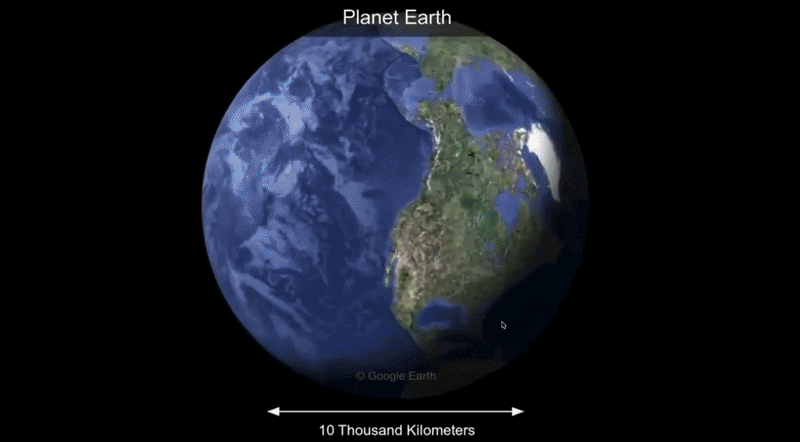
1. Universe to You — Everything Explained. Probably.
Visit exampleShort description: Built with scrollytelling.ai, "Universe to You" is a scroll-driven journey that zooms from the scale of the observable universe down to the human reader, layering typographic chapters, smooth Lenis-powered scrolling, and a varied font system (Bitter, Cormorant, Playfair, Space Grotesk and more) to give each scale of reality its own voice. It is an in-house demo of how the platform handles long-form, vertically chaptered narratives without video scrubbing.
What we like
- Pure CSS & scroll narrative: No heavy video scrubbing - the “zoom” effect is driven by typography, layout shifts, and chaptered sections, which keeps it cheap to load and friendly to mobile.
- Real-world performance: Field metrics from Chrome UX Report show a 1.0s FCP and 0.4s TTFB, with a 90 Performance score, 100 Best Practices and 100 SEO - proving long-form scrollytelling can still pass Core Web Vitals.
- Voice through typography: Each chapter switches typeface family to signal a change of scale (cosmic, scientific, personal), turning font choice itself into a storytelling device.
What could be improved
- Accessibility (80): The lowest score is accessibility - tightening color contrast on light-on-purple chapters and adding ARIA labels for the scroll narrative would push this into the green.
- Visual anchors: A small persistent “scale indicator” (e.g. 1026 m → 100 m) would help readers track where they are in the macro-to-micro journey.
- Reader navigation: A minimal chapter rail (like the Adidas report) would let returning visitors jump directly to a scale without re-scrolling the whole universe.
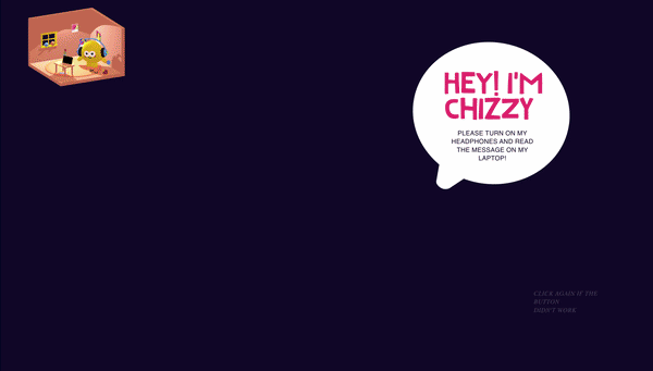
2. Singula Team - Chizzy: The Macro-to-Micro Journey
Visit exampleShort description: This demonstration showcases a seamless "Macro-to-Micro" scrollytelling experience. Using high-performance video scrubbing, it allows the user to travel from the vast scale of the observable universe down to the subatomic level, all controlled by scroll speed.
What we like
- Unrivaled Performance: Achieving a 99 performance score with full-screen video scrubbing is an incredible technical feat - the direct counter-argument to heavy examples like BMW or Lunarwheel.
- Smoothness of Interaction: Because the TBT is 0ms, the "zoom" effect feels physical and tactile, like a native application rather than a webpage.
- Minimalist Delivery: The interface stays out of the way of the visual narrative, passing the "50-millisecond" first impression test with ease.
What could be improved
- Accessibility Nuances: The remaining 4 points usually involve ARIA labels for scroll instructions or specific color contrast ratios for text overlays.
- Interactive Overlays: Adding "milestone markers" as the user reaches specific scales (e.g., "The Solar System," "The Human Cell") would add educational value.
- Navigation Hints: A small "Scroll to Zoom" indicator could help users unfamiliar with scrollytelling.
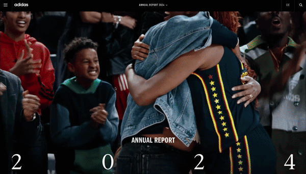
3. Adidas - Annual Report 2024: “Through Sport, We Have the Power to Change Lives”
Visit exampleShort description: The Adidas 2024 report is a masterclass in balance. It uses scrollytelling to navigate through the "Year in Review," financial statements, and sustainability targets. By breaking the report into interactive modules, Adidas turns a mandatory financial document into a compelling brand story.
What we like
- Technical Optimization: This is the benchmark for performance. Achieving a 94 performance score with full-screen imagery and scroll-triggered animations proves that scrollytelling can be "lean and fast."
- Micro-Interactions: Instead of heavy video-scrubbing, Adidas uses subtle CSS and SVG animations that "wake up" as you scroll. This provides the "Scrollytelling feel" without the "Performance tax."
- Navigation UI: The persistent, minimalist sidebar allows users to "jump" between chapters, solving the "infinite scroll" frustration often found in longer reports.
What could be improved
- CLS Fine-tuning: While 0.093 is a good score, it's the only metric not in the "perfect" range. Pre-setting the aspect ratios for their high-energy hero images could bring this down to a perfect 0.
- Accessibility Contrast: With an accessibility score of 91, there are likely a few areas where text overlays on busy sports photography could be sharpened for better readability for visually impaired users.
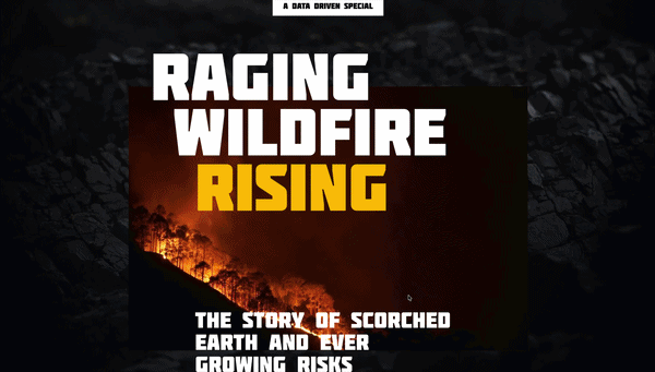
4. Maglr - Raging Wildfire Rising
Visit exampleShort description: This immersive report examines the global escalation of wildfires, combining scientific data with emotional storytelling. It utilizes Maglr's transition engine to move the reader through the causes, consequences, and future projections of climate-driven fire events.
What we like
- Atmospheric Storytelling: The use of "smoke" and "embers" as scroll-triggered overlays is incredibly effective. It creates a physical mood that heightens the narrative's urgency.
- Snappy Data Transitions: Maps and charts "build" themselves in perfect sync with the scroll - a great example of Triggered Animation that feels purposeful.
- Performance Excellence: Maintaining a 91 performance score on a page with this much visual "heat" is impressive. It proves that editorial scrollytelling doesn't have to be slow.
What could be improved
- Layout Stability: The 0.165 CLS suggests the page's "skeleton" isn't fully defined before the media loads. Using reserved containers would prevent slight "jumping."
- Contrast in Data Heavy Sections: Slightly more background contrast for the white text blocks would push the 96 accessibility score closer to a perfect 100.
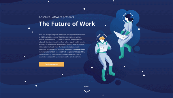
5. Absolute Software - The Future of Work: A Remote Security Report
Visit exampleShort description: This report, built on the Maglr platform, explores the shift toward hybrid work environments. Using a "space exploration" metaphor, it guides users through data regarding security, digital experience, and employee productivity in a post-office world.
What we like
- Thematic Consistency: The "Space" theme drives the scrollytelling. Elements like floating astronauts and drifting stars react to the scroll, creating a feeling of weightlessness that matches the "remote work" narrative.
- Balanced Interactivity: It maintains an 85 performance score with "Triggered Animations" without sacrificing responsiveness.
- Bite-sized Data: Complex security statistics are served in small, digestible chunks as you scroll, preventing "Content Fatigue."
What could be improved
- LCP Prioritization: The 2.5s LCP could be improved by pre-loading the hero SVG/image to move this metric into the green zone.
- Vertical Scroll vs. Navigation: The transition between "pages" within the Maglr viewer can sometimes feel slightly jarring. Adding smoother fade transitions between chapters could enhance the "cinematic" feel.
6. YesNo - The Power of Binary Design
Visit exampleShort description: YesNo is a creative studio that utilizes a strikingly minimalist, "brutalist" scrollytelling approach. The site is built around a binary concept, using scroll to drive bold typographic transitions and stark black-and-white visual shifts.
What we like
- Visual Confidence: The "Raw" minimalism is incredibly effective. It passes the 0.05-second "Gut Feeling" test by looking intentionally bold and authoritative.
- Technical SEO Excellence: Achieving a perfect 100 in both SEO and Best Practices while maintaining an avant-garde design is a significant feat.
- The "Binary" Pacing: The scroll moves through sharp, decisive changes that reinforce the studio's name. A masterclass in using Triggered Animation to build a brand identity.
What could be improved
- Main Thread Optimization: A 1,320ms TBT indicates the JavaScript for sharp shifts is "blocking" the browser.
- Layout Stabilization: The 0.165 CLS suggests large typography containers aren't pre-defined in the CSS.
- Responsiveness Speed: Lightening the initial script load would bring the performance score into the green zone.
7. Melvin Winkeler - Motion & Digital Design
Visit exampleShort description: Melvin Winkeler's portfolio uses a "Liquid-to-Grid" scrollytelling approach, where smooth, elastic transitions guide through project selections. It leans into the "Reveal" Mechanic, where elements morph and stretch as they enter the viewport.
What we like
- Elasticity of Motion: The "bounce" and flow of elements are incredibly satisfying. It turns a standard portfolio into a tactile experience with physical "pull."
- Structural Perfection: A Perfect 100 in Best Practices and SEO means the site isn't just a pretty face - it's robust and search-ready.
- Typographic Hierarchy: Bold, large-scale headers work in tandem with motion to create a clear narrative flow.
What could be improved
- Main Thread Health: The 1,370ms TBT is the primary bottleneck. Optimizing script execution would make elastic transitions feel even more instantaneous.
- Layout Stabilization: The 0.147 CLS suggests some animated containers aren't pre-defined in size.
- Accessibility Nuances: The remaining 4 points often relate to "color contrast" of interactive elements or hover states.
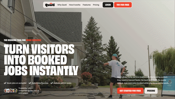
8. Quoti - AI-Powered Sales Automation
Visit exampleShort description: Quoti uses a product-centric scrollytelling approach to showcase its AI sales assistant. By using scroll-triggered UI reveals, the site walks potential customers through the process of automating quotes and sales follow-ups.
What we like
- The "Show, Don't Tell" Strategy: The scrollytelling effectively mimics the software's dashboard in action, without requiring a demo sign-up.
- Structural Perfection: Achieving 100 in both SEO and Best Practices gives an "Enterprise-grade" feel.
- Modern Aesthetic: The clean, tech-focused design passes the 0.05-second "Gut Feeling" test, establishing immediate B2B trust.
What could be improved
- Visual Stability: The 0.384 CLS is the highest in these reviews. Reserved space for interactive "floating" elements is essential.
- Interaction Snappiness: The 1.7-second blocking time makes "scroll-to-reveal" feel sluggish.
- Speed Index: A 4.1s Speed Index suggests the page takes too long to look "complete."

9. Inversa - Regenerative Leather for a Healing Planet
Visit exampleShort description: Inversa uses scrollytelling to turn a complex environmental problem (invasive species) into a luxury solution (regenerative leather). The site functions as a vertical documentary using "pinned" nature photography - a masterclass in using the Pacing key to slow the reader down and make them absorb the mission's impact.
What we like
- Narrative Depth: The site doesn't just sell leather; it sells a "Regenerative Future." The transition from "problem" to "solution" is handled with cinematic grace.
- Visual Stability: A CLS of 0.033 on a scrollytelling site is incredibly rare. It shows a high level of front-end care.
- Structural Excellence: A Perfect Double 100 in SEO and Best Practices ensures the conservation message is perfectly indexed.
What could be improved
- Interactivity Lag: The 1,290ms TBT is the "hidden tax" of high-end imagery. Optimizing scroll-triggering scripts would help.
- Accessibility Contrast: Small areas where white text overlays busy nature photography. Adding a subtle gradient "scrim" would help.
- Asset Loading: The Speed Index of 3.8s suggests using more aggressive image compression or AVIF format.
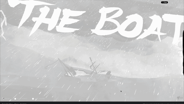
10. SBS - The Boat
Visit exampleShort description: Based on the short story by Nam Le, The Boat is a landmark piece of interactive journalism. It tells the story of Mai, a young girl fleeing Vietnam after the fall of Saigon. The site uses a unique "shaking" scrollytelling mechanic to simulate the physical and emotional turbulence of being at sea.
What we like
- Emotional Immersion: Perhaps the most famous example of "emotional scrollytelling." The tilting and rocking creates a physical sensation of seasickness that perfectly matches the story's intensity.
- Audio Integration: The soundscape is perfectly synced to the scroll depth. Howling wind and crashing waves intensify as the visual storm worsens.
- Artistic Direction: The hand-drawn, ink-wash style is visually stunning, feeling simultaneously like a traditional graphic novel and a high-tech digital experience.
What could be improved
- Resource Optimization: A 4.6s LCP is high. Using modern image formats and better compression for background layers could bring this under the 3-second mark.
- Initial Load Experience: A more engaging loading screen would help retain users who might otherwise bounce during the 4+ seconds of waiting.
- Layout Stability: The 0.201 CLS is quite high. Reserving specific containers for the animated ink layers would prevent text from jumping.
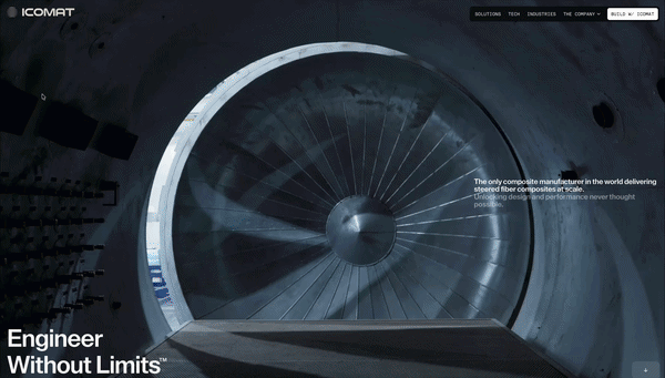
11. iCoMat - Revolutionizing Composite Manufacturing
Visit exampleShort description: iCoMat uses scrollytelling to explain their breakthrough "Continuous Tow Steering" (CTS) technology. The site takes users on a high-tech manufacturing journey, showing how their patented process creates lighter, stronger, and more sustainable composite structures for the aerospace and automotive industries.
What we like
- Technical "Exploded Views": The site effectively "dissects" the composite manufacturing process, showing exactly how their steering technology differs from traditional methods.
- B2B Authority: The design is clinical, professional, and sophisticated - making "Deep Tech" feel accessible and exciting.
- Macro-to-Micro Engineering: Much like the Singula/Chizzy example, iCoMat uses the scroll to move from a wide view down to microscopic fiber-steering detail.
What could be improved
- Script Optimization: A 1,930ms TBT is a significant bottleneck for a site aiming to showcase "innovation."
- Visual Anchoring: The 0.176 CLS indicates interactive "technical stages" loading without pre-defined heights.
- Mobile-First Interactivity: Lighter SVG-based animations for smaller screens would help maintain engagement across all devices.

12. Lunarwheel - A Cosmic Creative Showcase
Visit exampleShort description: Lunarwheel is the digital portfolio of a creative studio, designed as a 3D journey through space. It utilizes advanced WebGL scrollytelling to move the user through a "lunar" landscape, where project case studies are presented as celestial bodies.
What we like
- Visual Ambition: This is "High-Art" scrollytelling. The 3D textures, lighting, and camera paths are cinematic, pushing the boundaries of what is possible in a browser.
- Seamless 3D Pacing: As you scroll, you are flying through a 3D scene - a level of immersion that a standard 2D site cannot match.
- Branding Synergy: Every interaction feels weighted and atmospheric, perfectly representing a boutique creative agency.
What could be improved
- Resource Management: A 21-second Total Blocking Time is a "deal-breaker" for most organic traffic. The JavaScript overhead is overwhelming.
- Initial Loading UX: A "lighter" initial landing state that loads the 3D assets in the background would prevent the 21-second "lock-up."
- Canvas Stability: Defining a fixed aspect-ratio container for the 3D canvas would stop the "SEO-friendly" text from shifting.
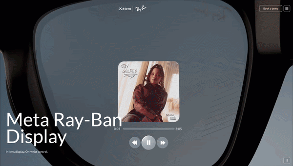
13. Ray-Ban Meta - The Smart Glasses Showcase
Visit exampleShort description: This landing page for the Ray-Ban Meta smart glasses is a masterclass in "Fashion-Tech" storytelling. It uses scrollytelling to bridge the gap between high-end eyewear and wearable technology, allowing users to virtually "dissect" the glasses and see integrated cameras, speakers, and AI sensors in action.
What we like
- The "Exploded View" Transition: As you scroll, the glasses break apart into their technical components - the ultimate use of the "Reveal" Mechanic.
- Lifestyle to Tech Pivot: The page starts with lifestyle photography and moves into high-res 3D renders, selling the vibe before explaining the specs.
- Visual Stability: Achieving a 0.052 CLS with this many overlapping 3D assets is a major win.
What could be improved
- Script Overload: A 1,600ms TBT - likely a combination of animation libraries and aggressive e-commerce tracking. Reducing third-party script bloat would help.
- Accessibility Contrast: Some technical labels during the "exploded view" can be difficult to read against moving 3D backgrounds.
- Mobile Interactivity: The high TBT leads to "jagged" movement on mobile. Lighter-weight triggers would preserve the "3-second decision" window.
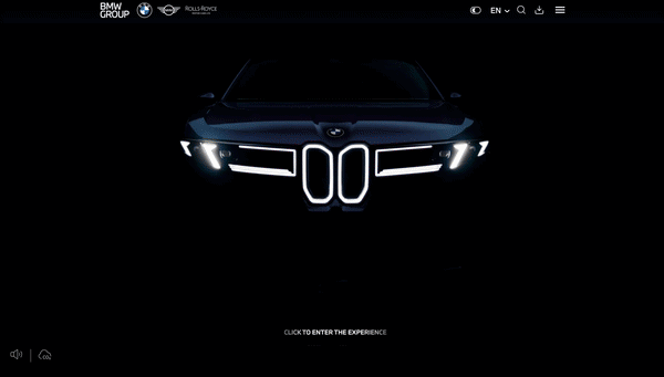
14. BMW Group Report 2025
Visit exampleShort description: The 2025 report is titled "On the path to electric and digitalised mobility in a sustainable circular economy." It uses four main "Stories" to guide stakeholders through the company's transformation. It is a bold, high-resolution experiment in "Stakeholder Engagement" that feels more like an app than a document.
What we like
- The "Symbiotic Drive" Concept: A specific section where the scrollytelling mimics the interaction between the driver and the AI assistant. It's a great use of the "Reveal Mechanic" to explain complex Level 2+ driver assistance technology.
- Brand Transitions: Seamlessly moving from the minimalist MINI aesthetic to the luxury of Rolls-Royce within a single scrolling flow.
- Circular Economy Visualization: Using scroll-triggered animations to show how materials like cobalt and nickel are recovered and reused in a loop.
What could be improved
- Main Thread Congestion: The 15-second blocking time is likely caused by the "Superbrains" graphics being rendered in the browser. These assets need to be offloaded to worker threads or served as lighter-weight image sequences.
- Interactivity Lag: Because the performance score is so low, users might experience "stuck" scrolling where the page doesn't move despite them swiping. This breaks the immersion and defeats the purpose of scrollytelling.
Build your own scrollytelling experience
Create stunning, interactive visual stories without writing a single line of code. Join thousands of creators using Scrollytelling.
Start for free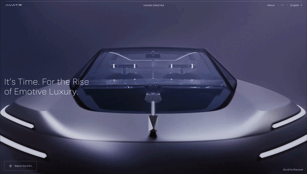
15. AVATR - Vision: The Future of Luxury Mobility
Visit exampleShort description: AVATR Vision is a high-concept scrollytelling experience showcasing the brand's philosophy of "Emotional Intelligence" in automotive design. It uses high-fidelity 3D renders, smooth parallax transitions, and reactive UI elements to guide through interior and exterior details of next-generation luxury EVs. The site functions as a digital manifesto.
What we like
- Cinematic Fluidity: The camera movement through 3D space as you scroll feels expensive and futuristic, passing the 0.05-second "Gut Feeling" test effortlessly.
- Structural Integrity: A Perfect Double 100 in SEO and Best Practices is impressive for such a media-heavy site.
- The "Detail Reveal": AVATR uses the scroll to "peel back" vehicle layers, a masterclass in "Show, Don't Tell."
What could be improved
- Main Thread Health: A 2,170ms TBT is significant technical debt. The website should feel as responsive as the vehicle's onboard computer.
- Layout Stability: The 0.174 CLS suggests interactive containers aren't pre-defined in CSS.
- Mobile Efficiency: Lighter SVG-based triggers or lower-res placeholders for mobile would preserve the "Vision" across all devices.
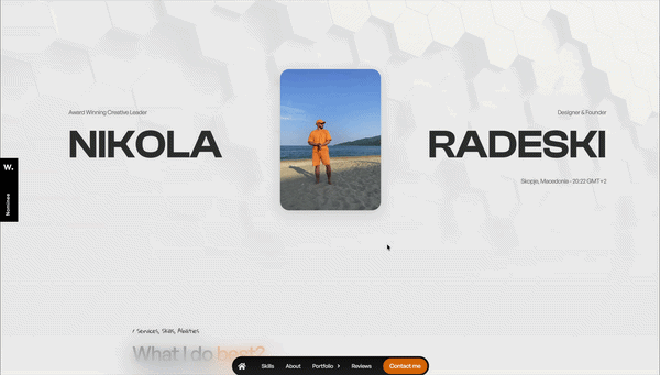
16. Nikola Radeski - Digital Art Direction & Design
Visit exampleShort description: Nikola Radeski's portfolio utilizes a sophisticated "horizontal-to-vertical" scrollytelling flow, where vertical scroll triggers horizontal movements and smooth, liquid-like transitions between project case studies. An "Experience-First" site designed to prove mastery of digital motion.
What we like
- The "Axis-Shift" Navigation: Moving horizontally as you scroll vertically - one of the most effective uses of the Pacing key. It feels like navigating a high-end physical gallery.
- Minimalist Authority: Whitespace and massive typography command attention instantly - it looks expensive, professional, and modern.
- Interactive Project Reveals: Background imagery "morphs" to fill the screen, creating a cinematic sense of immersion for each case study.
What could be improved
- Mobile Asset Weight: A 7.6s LCP on mobile suggests high-resolution images aren't properly optimized for smaller screens.
- Initial Interaction Lag: The 410ms TBT can make the first scroll feel "sticky."
- Pre-loading Strategy: A progress indicator would help manage user expectations during the 7-second LCP window.
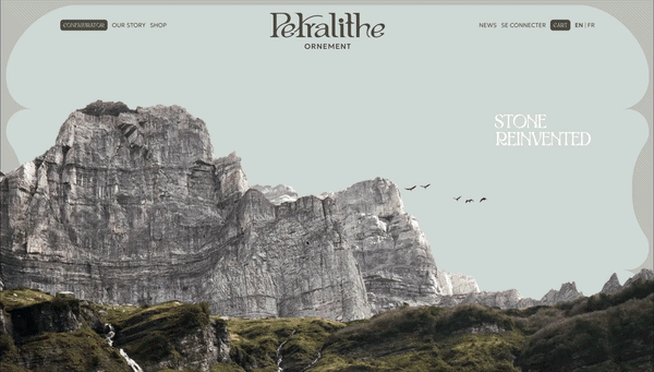
17. Petralithe - The Essence of Natural Stone
Visit exampleShort description: Petralithe uses an architectural scrollytelling approach to showcase high-end natural stone collections. The site acts as a digital gallery, using a slow, deliberate scroll to "unveil" different textures, colors, and applications with massive, full-screen imagery.
What we like
- Visual Grandeur: The site perfectly captures the "Heavy Luxury" aesthetic. Whitespace combined with high-contrast stone textures makes the product feel expensive and exclusive.
- The "Unveiling" Flow: Text stays pinned while background textures slide behind it, creating a tactile sense of "exploring" a material library.
- Structural Perfection: A Perfect Double 100 in SEO and Best Practices - even with a 32 performance score, the foundation is rock-solid.
What could be improved
- The "Stone-Weight" Performance: A 2,840ms TBT is a major bottleneck. Optimizing parallax scripts would make navigation feel as smooth as polished marble.
- Asset Optimization: The 4.1s LCP could improve with modern image formats (AVIF/WebP) and lazy-loading below the fold.
- Layout Stability: The 0.169 CLS - reserving space for image containers would prevent text from jumping.
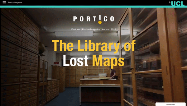
18. UCL Portico - The Library of Lost Maps
Visit exampleShort description: Featured in the Autumn 2025 issue of UCL's Portico Magazine, this digital story explores a rare collection of historical maps. It utilizes scrollytelling to provide a "curated zoom" experience, where scrolling pan-rotates and focuses on specific cartographic details that coincide with the written history of London's evolution.
What we like
- Curated Exploration: The "pinned text" approach works perfectly. It allows the maps to move and zoom in the background while the text stays readable, mimicking a museum tour.
- Asset Quality: The maps are incredibly high-detail. The scrollytelling engine handles the zoom levels well, adding a layer of tactile authenticity.
- Clean Narrative Arc: The transitions between different maps feel like natural "scene changes," keeping the reader oriented in space and time.
What could be improved
- Asset Weight Management: The 6.9s LCP is the primary bottleneck. These maps need to be served in modern formats (WebP or AVIF) with aggressive lazy-loading.
- Input Latency: The TBT of over 1.3 seconds indicates heavy JavaScript. Simplifying the "scroll-to-zoom" logic would make the interaction feel smoother.
- Layout Shifts: Hard-coding the container dimensions in CSS would prevent the text from jumping.
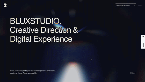
19. Blux Studio - A Dynamic Digital Showcase
Visit exampleShort description: Blux Studio uses a high-impact, "liquid" motion style to showcase its creative capabilities. The site is a continuous scrollytelling journey that utilizes massive typography and morphing transitions.
What we like
- Visual Fluidity: The transitions are morphing experiences that keep the eye engaged and perfectly demonstrate the studio's expertise in motion design.
- Typography as Art: Massive, bold headers react to the scroll, making the text a core part of the visual aesthetic.
- Thematic Consistency: The website serves as its own best case study, proving technical and creative authority the moment visitors arrive.
What could be improved
- Main Thread Optimization: A 2,050ms TBT can lead to "sticky" scrolling on mid-range devices. Offloading animation logic to CSS would help.
- Accessibility Refinement: A score of 77 indicates some users might struggle. Increasing contrast on text overlays would bridge this gap.
- Initial Load Weight: More aggressive "lazy-loading" for sections further down the scroll path would lighten the initial browser load.
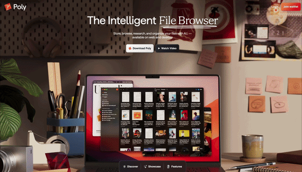
20. Poly - AI-Powered 3D Asset Generation
Visit exampleShort description: Poly is a cutting-edge platform for generating 3D textures and models using AI. Its website is a "living demo" of its own technology, utilizing a full-screen WebGL scrollytelling environment where 3D shapes morph and rotate as the user scrolls.
What we like
- Product-as-Interface: A brilliant "Show, Don't Tell" strategy. By manipulating 3D textures in real-time, the user understands the value without reading technical documentation.
- Immersive 3D Space: The movement feels premium and futuristic, like a high-end Silicon Valley tool.
- Zero Layout Shift: Achieving a 0 CLS while managing a complex 3D canvas is a significant technical achievement.
What could be improved
- Mobile Optimization: An 11.2s LCP on mobile is a major barrier. A "Lite" version or 2D placeholder for mobile would help.
- Input Responsiveness: The 833ms INP makes the "story" feel sluggish on mobile.
- Accessibility Labels: With a score of 76, several 3D elements are likely invisible to screen readers.

21. Chanel - The J12 Watch: A Study in Ceramic
Visit exampleShort description: Chanel uses scrollytelling to elevate the J12 watch from a product to a piece of art. The experience focuses on the "allure" of the watch, using smooth parallax transitions and high-resolution video sequences to showcase its revolutionary ceramic construction.
What we like
- The "Material Reveal": As you scroll, the lighting shifts across the ceramic surface, highlighting its unique "luster" in a way static images never could.
- Cinematic Pacing: It uses the Pacing key of scrollytelling to let each chapter land with the weight of a luxury brand.
- High-End Typography: The integration of the iconic Chanel font with moving backgrounds is flawless.
What could be improved
- The "Loading Barrier": A 6.8s LCP is an eternity in digital time. For a brand that represents precision (watches), a slow-loading site is a major contradiction.
- Interactivity Lag: The 1,000ms TBT indicates the page is "heavier" than it needs to be.
- Accessibility Contrast: With a score of 80, there are likely issues with text-to-background contrast.
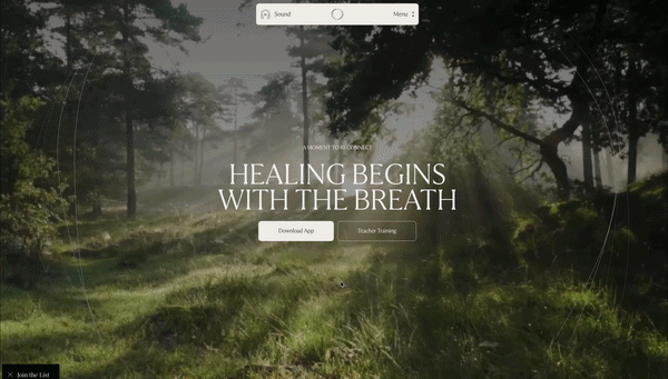
22. Frequency Breathwork - An Immersive Digital Journey
Visit exampleShort description: Frequency Breathwork uses a "Cinematic Scrollytelling" approach to translate the visceral experience of a breathwork session into a digital format. Slow-motion video backgrounds, soft-blur transitions, and synchronized typography guide the user through the benefits, creating an environment that feels more like a meditation app.
What we like
- Sensory Pacing: The site perfectly understands the Pacing key. Transitions are intentionally slow and rhythmic, mirroring the breathwork practice itself.
- Structural Perfection: A Perfect Double 100 for SEO and Best Practices is incredibly difficult for a media-heavy site.
- Visual Cohesion: Gradients and light-play create a seamless "infinite loop" feel - using Environment as a Narrative.
What could be improved
- Script Deferral: A 1,930ms TBT is counter-productive for a wellness site. The frustration of a "stuck" scroll can break the meditative state.
- Asset Optimization: The 4.4s LCP and 5.7s Speed Index suggest high-resolution background videos are the main bottleneck.
- Accessibility Contrast: Adding subtle shadows over moving, ethereal backgrounds would ensure total inclusivity.
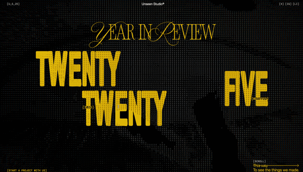
23. Unseen - The 2025 Annual Report
Visit exampleShort description: The Unseen Report 2025 is a powerful, humanitarian-focused digital experience. It uses gritty, high-contrast photography and bold typography to tell the "unseen" stories of modern slavery and human trafficking through a vertical scrollytelling flow.
What we like
- Emotional Gravity: The design choices - grainy black-and-white imagery and minimalist layouts - perfectly match the urgency of the subject matter.
- The "Cinematic Reveal": Text layers "slide" over high-impact photography, creating a sense of depth and discovery.
- Visual Stability: Achieving a 0.054 CLS with such large media files is impressive.
What could be improved
- Mobile Asset Optimization: A 13.9s LCP is devastating for mobile engagement. Images must be served via a CDN in efficient formats (like AVIF).
- Server Response Time: The 1.6s TTFB indicates a slow server. Improving server-side caching would give the site a much-needed "head start."
- Scrolling Fluidity: The 833ms INP suggests heavy transition logic for mobile processors.
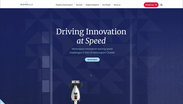
24. Bidwells - Driving Innovation at Speed
Visit exampleShort description: Bidwells explores how the UK's Motorsport Valley - the engine room for Formula 1 - is accelerating breakthroughs in clean energy, defense, and healthcare. The report uses scrollytelling to bring data and real-world impact to life.
What we like
- The Industry Hook: Linking real estate and regional growth to the high-stakes world of F1 makes for a compelling narrative.
- Data Visualization: The report effectively uses maps and infographics to showcase the density of the 4,300+ companies within the Motorsport Cluster.
- Clean Branding: The typography and color palette feel authoritative and "premium," fitting for a high-level research paper.
What could be improved
- Layout Stability: The 0.907 CLS is the most urgent issue. The cookie banner and hero images seem to load without reserved space, causing the entire page to "jerk" downward.
- Script Optimization: A TBT of 2,460ms suggests the page is loading a "heavy" amount of third-party tracking or unused animation libraries.
- Cookie UX: The cookie consent banner currently dominates the "above-the-fold" experience, contributing to the poor LCP.
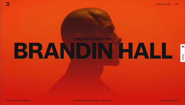
25. Brandin - A Bold Creative Portfolio
Visit exampleShort description: Brandin's portfolio is a high-octane example of modern "Motion-First" design. It uses liquid-style transitions and oversized typography to showcase brand identities and creative direction as a continuous, high-energy scrollytelling loop.
What we like
- Visual Impact: The site has an incredible "Cool Factor." The typography morphs and reacts to the scroll - it passes the 0.05-second "Gut Feeling" test perfectly.
- Fluid Pacing: The transition between project case studies is seamless. It feels like one long, evolving brand story.
- Creative Authority: The site itself is a portfolio piece, demonstrating mastery of motion and layout.
What could be improved
- The "Main Thread" Congestion: A 4,000ms TBT is a major risk. On many mobile devices, the site will likely "stutter."
- Asset Loading Strategy: The 3.8s LCP suggests too many high-resolution assets requested at once.
- Layout Shifts: Ensuring large typography containers have pre-defined heights would prevent content from "snapping" into place.
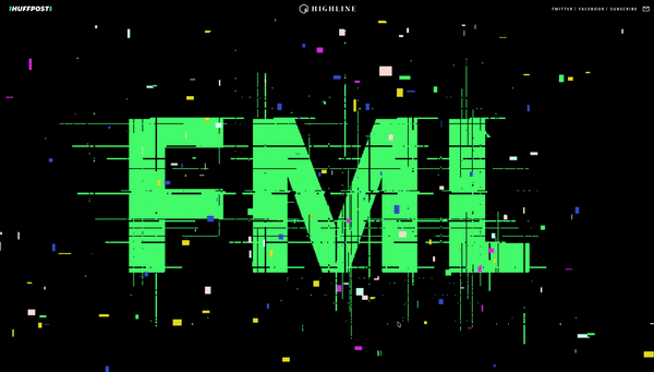
26. HuffPost Highline - Poor Millennials
Visit exampleShort description: This landmark piece of long-form journalism uses an "8-bit video game" scrollytelling aesthetic to illustrate systemic economic challenges faced by a generation. It transforms a deep-dive data report on wages, debt, and housing into a playable narrative where your "character" navigates the "level" of life.
What we like
- Metaphorical Brilliance: Using the "Game of Life" visual language to explain the "rigged" nature of modern economics is genius. It turns abstract statistics into a physical journey.
- Bite-sized Data: Complex economic charts are integrated directly into the "game world," making the data feel contextual rather than disruptive.
- The "Scroll-to-Walk" Mechanic: It perfectly utilizes the Pacing key of scrollytelling. You are physically "moving" through a timeline.
What could be improved
- The "Performance Tax": An 11/100 performance score is critical. The 4-second TBT means many mobile users will never actually see the content.
- Mobile Responsiveness: The complex 8-bit layout is designed for wider screens. On mobile, the "game world" can feel cramped.
- Navigation Speed: Adding "level markers" or a table of contents would help users reference specific data points without re-scrolling.
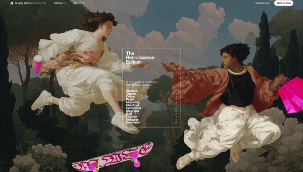
27. Shopify Editions | Winter '26
Visit exampleShort description: Shopify's "Renaissance Edition" introduces over 150 updates, focusing heavily on AI agents and "Sidekick." While it is a masterclass in visual storytelling, it serves as a cautionary tale about the heavy performance "tax" required for such complex layouts.
What we like
- Visual Stability: Despite the massive amount of moving parts, the CLS (Cumulative Layout Shift) is 0, meaning elements don't "jump around" as they load. It proves that you can have complex animations without sacrificing a stable visual experience.
What could be improved
- The Performance-to-Experience Balance: While the page is stunning, the 6.6s LCP on mobile means over half of your potential visitors might bounce before the first "Renaissance" graphic even appears.
- Optimization: The 833ms INP suggests that the JavaScript required for scrollytelling is "blocking" the main thread. To fix this, Shopify would need to prioritize "Lightweight Interaction" triggers over heavy video scrubbing for mobile users.
- Server Speed: The 1.1s TTFB indicates that even before the "heavy" images load, the server is slow to respond. This is a technical bottleneck that hurts SEO rankings regardless of how pretty the images are.
The benefits of scrollytelling in web design
Scrollytelling transforms a passive "wall of text" into an active, cinematic journey where the user controls the tempo. By tethering animations and data reveals directly to the physical act of scrolling, you create a reward-based feedback loop - every flick of the finger provides a visual payoff that keeps the reader moving.
Why it wins:
- Cognitive Ease: Complex data is "unveiled" in bite-sized, sequential layers, preventing information overload.
- Bespoke Pacing: The user becomes the director, lingering on details or breezing through the narrative at their own speed.
- Emotional Hook: It bridges the gap between static reading and video, providing the immersion of a film with the interactivity of a website.
Essentially, scrollytelling doesn't just present information; it engineers an experience that significantly increases dwell time and message retention. These same principles - pacing, emotional hooks, and strategic information reveals - are also core to feature writing.
When to use scrollytelling
Scrollytelling is a high-stakes design choice. The rule is simple - use it to narrate, not just to decorate.
Use it when:
- The Story is Linear: Your content has a clear beginning, middle, and end (e.g., a "Year in Review" or a product's origin story).
- The Product is Complex: You need to "unfold" technical layers, like an exploded 3D view of a watch or a step-by-step software tour.
- Data needs Pacing: You have heavy statistics that would overwhelm a reader if shown all at once. Scrolling "unveils" data points one by one.
- You're Selling a "Vibe": For luxury or fashion, scrollytelling creates an immersive, cinematic atmosphere that static images can't match.
Avoid it when:
- Speed is the Priority: If a user is looking for a "Contact Us" page or a support document, scrollytelling is just a barrier.
- Mobile Performance is Weak: If you can't optimize for a Performance Score of 90+, don't force a 15-second loading screen on a mobile user.
- Content is Frequent: It's too expensive and time-consuming for daily blog posts or news cycles.
FAQ
The most common questions answered with a focus on performance, narrative, and technical reality.
How does scrollytelling work?
Technically, a script (like GSAP or a native Intersection Observer) tracks the user's vertical or horizontal scroll progress. As the user moves, the script "scrubs" through an animation timeline - whether that's moving a 3D model, changing text opacity, or playing a video frame-by-frame.
The Key: The user becomes the "conductor" - when they stop scrolling, the story stops. If they scroll fast, the story accelerates. This creates a physical link between the reader and the content.
Is scrollytelling right for you?
It depends on your goal. Ask yourself these 3 questions:
- Is my message complex? If you're explaining a 10-step manufacturing process or a 50-page annual report - Yes.
- Is my brand "Premium"? If you need to establish authority and "WOW" factor - Yes.
- Is my user looking for a quick answer? If they just want a price list or a support phone number - No. Scrollytelling is designed mostly for exploring, not searching.
What makes a good scrollytelling story?
A great scrollytelling piece follows:
- Pacing - Don't overwhelm the user. Provide "breathing room" between major visual transitions.
- Purpose - Every animation should serve the data. If a 3D model spins just because it looks cool, it's a distraction, not storytelling.
- Performance - A 10-second load time is not the way to go. A good story must be lean with good performance. As seen in our reviews above, an Adidas-level 94 score is the gold standard.
What's the difference between scrollytelling and parallax?
While often confused, they serve different use cases:
| Feature | Parallax Scrolling | Scrollytelling |
|---|---|---|
| Primary Goal | Visual depth / aesthetic | Narrative progression |
| Trigger | Layers moving at different speeds | Content changes triggered by scroll depth |
| Interaction | Passive (looks cool as you pass) | Active (you "unlock" the next part) |
| Best For | Landing pages & backgrounds | Reports, tutorials, and deep-dives |
Is scrollytelling good for SEO?
This is a double-edged sword:
- It increases Dwell Time (the time people stay on your page) - a huge positive signal for Google. Some experts say this is the most important factor.
- If not built correctly, scrollytelling sites can appear "empty" to search crawlers because the content is hidden behind JavaScript, or too heavy because of many images, videos, and other media.
Ready to create your scrollytelling story?
No code required. Build interactive, scroll-driven experiences that captivate your audience and rank on Google.
Get started for free