One page website examples: 7 single-page sites worth studying
Real one-page websites, from a design studio that fits its whole practice on one scroll to an annual report with no PDF. For each: what it is, why a single page works for it, and the one idea to take.
A one-page website puts the whole site on a single scrolling page, with anchor links instead of a menu. The examples below were chosen because each shows a different job the format does well: a portfolio, a studio, a product vision, a report, a story, an explainer. Every one was checked: the entire site really is one page. If you came for the one-page document, the investor or sales kind, you want one-pager examples instead.
Six jobs a single page does well
| Type | Typical sections | Example below |
|---|---|---|
| Portfolio | Hero, three best pieces, services, about, contact | Nikola Radeski |
| Studio or agency | Belief, work, people, contact | YesNo, Lunarwheel |
| Product or concept | Promise, features in order, proof, one action | AVATR Vision |
| Report | Numbers, highlights, people, outlook | Unseen 2025 |
| Story or editorial | Scenes in sequence, no exits | SBS The Boat |
| Explainer | Big to small, pinned facts, revealed detail | Universe to You |
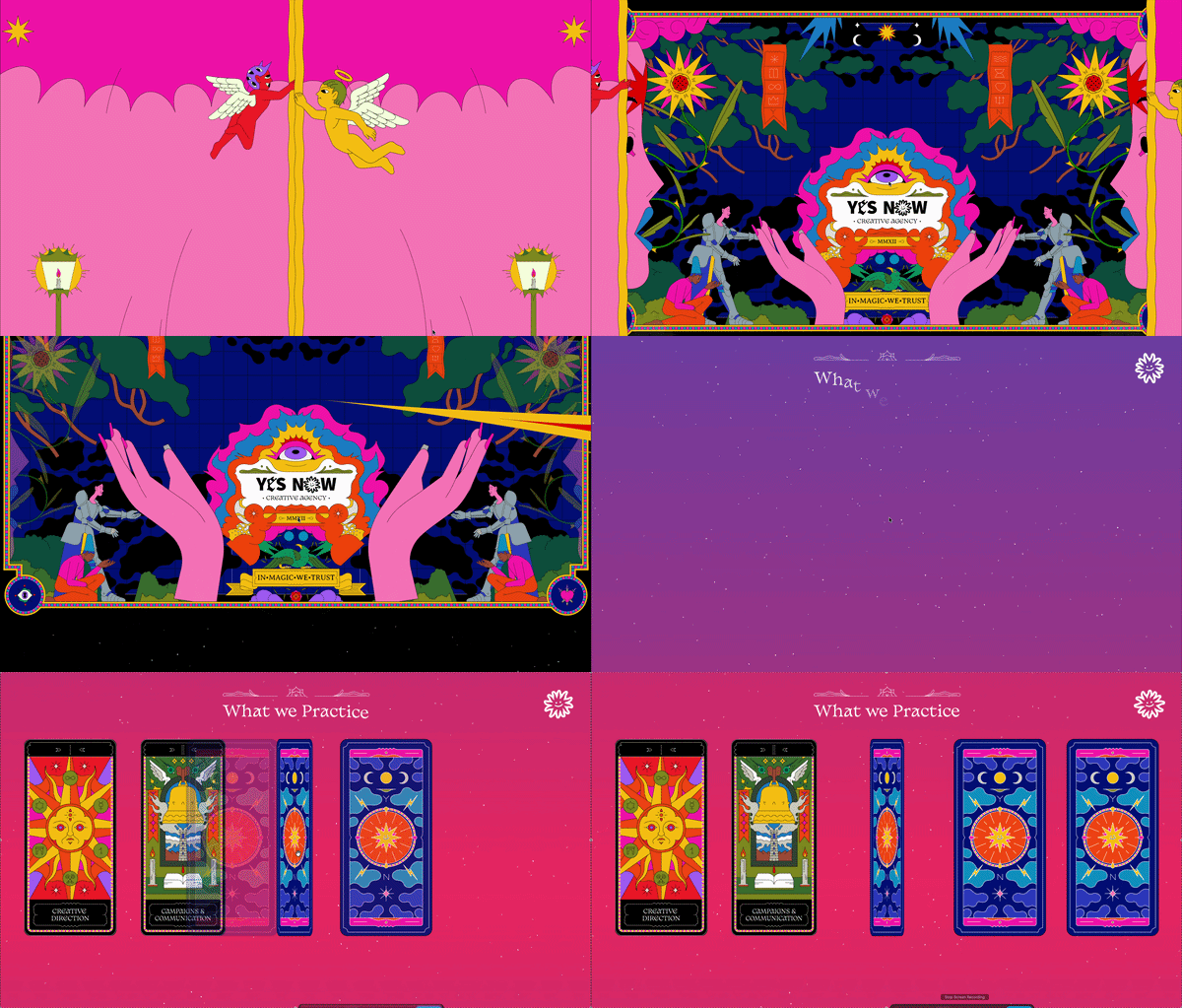
1. YesNo — a studio's whole practice on one scroll
Visit the site ↗What it is: YesNo is a design studio whose entire website is a single black-and-white page: a manifesto about binary design, the work, the people, the contact, all one scroll long.
Why one page works here: A studio sells a point of view before it sells services. One page lets that point of view run uninterrupted from the first line to the contact form; a menu would have broken the argument into tabs nobody reads in order.
Steal this: Lead with a belief, not a service list. If your work has a philosophy, the page is the place to state it, and the work becomes the evidence.

2. Lunarwheel — a cosmic single-page showcase
Visit the site ↗What it is: Lunarwheel presents its creative work as one long, space-themed scroll: a hero that sets the scene, projects that arrive as you move, and a single closing contact. The only other link switches language.
Why one page works here: A showcase is a sequence, and a single page keeps the sequence in the author's hands. The visitor sees the work in the intended order, at the intended pace, with the mood never interrupted by a page load.
Steal this: Treat the page as a reel. Decide the order of your pieces deliberately and let scroll-driven reveals carry the transitions.

3. AVATR Vision — a car maker's concept on one page
Visit the site ↗What it is: AVATR put its future-mobility concept on its own subdomain as a single cinematic scroll: a dozen anchor links in the header, one page underneath, one story from the first frame to the last.
Why one page works here: Concepts have no catalogue to link to, so a multi-page structure would be padding. The anchor menu gives a long page the feeling of navigation while keeping the narrative intact, and the subdomain keeps it separate from the product site.
Steal this: Use anchor links as your menu. Visitors get the comfort of a navigation bar; you keep the control of a single story.
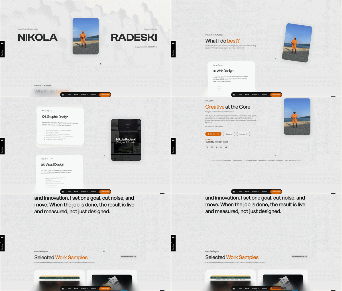
4. Nikola Radeski — a one-page design portfolio
Visit the site ↗What it is: An art director's portfolio built as one scrolling page with twenty-plus anchor links: selected work, services, about and contact, each a section rather than a page.
Why one page works here: Portfolios are judged in under a minute. One page means the best work is one scroll away from the headline, and the contact is never more than a flick away from the work that impressed.
Steal this: Put your three strongest pieces right under the hero. A portfolio is not an archive; the archive can live behind one link.
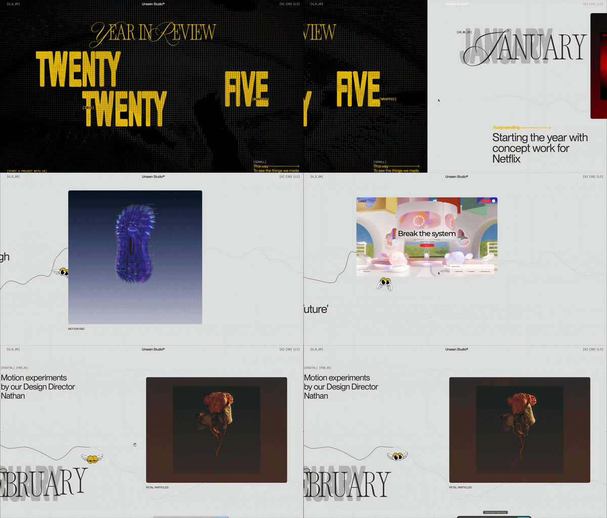
5. Unseen 2025 — an annual report that is one page
Visit the site ↗What it is: Photography platform Unseen publishes its annual report at a year-stamped subdomain as a single scroll story: numbers, highlights, the people, the year ahead. No PDF, no sub-pages.
Why one page works here: Reports get read when they are easy to start and hard to stop. A one-page report has no table of contents to bounce from; the reader just keeps going, and animated numbers do the work tables used to.
Steal this: Anything you publish as a PDF is a one-page website waiting to happen. Give each year its own address so the archive builds itself.

6. SBS The Boat — a story told on one page
Visit the site ↗What it is: SBS adapted a graphic novel about a refugee journey into one interactive page: illustration, sound and motion driven entirely by the reader's scroll, start to finish, with nothing to click away to.
Why one page works here: Narrative needs continuity. Splitting the story into chapters on separate pages would have added loading screens to a piece whose power is its uninterrupted drift. One page keeps the reader inside it.
Steal this: Match motion to meaning. The animation here serves the mood of the story rather than showing off, which is the standard any scroll-driven page should be held to.
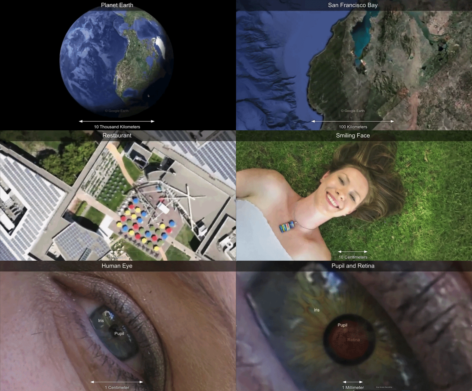
7. Universe to You — a one-page explainer built in minutes
Visit the site ↗What it is: Our own demonstration: a long, scroll-driven explainer about the universe, built with Scrollytelling from a short brief. Hero video, pinned sections, revealed facts, one page, no code.
Why one page works here: An explainer has a natural order, big to small, first to last, and one page preserves it. It also shows what the generated route produces: the same single-page structure as the hand-built sites above, without the agency.
Steal this: If your content has an order, do not break it into pages. Let the scroll carry the reader from the first idea to the last.
The patterns across all 7
- One job each. A practice, a reel, a concept, a portfolio, a report, a story, an explainer. None of them tries to be two things.
- Anchor links, not menus. The header still looks like navigation; it just scrolls instead of loading. Visitors get orientation, the author keeps the sequence.
- The hero earns the scroll. Each opens with a full-screen scene that states the subject in seconds; the rest of the page pays off that promise.
- Motion marks structure. Pinned heroes, reveals and counting numbers appear where the content changes gear, not everywhere.
- One call to action. Contact, read, explore. The strongest pages ask for exactly one thing and ask twice.
FAQ
What makes a good one-page website example?
One clear job, a section order that mirrors how the visitor decides, anchor navigation instead of a menu, motion that marks structure rather than decorates, and exactly one call to action repeated at the end. Every example above does all five.
Are these one-page websites good for SEO?
They rank for their names and their one topic, which is what they need. A single page cannot rank for many different searches; see the honest SEO section in the one-page website guide before choosing the format for a content-heavy business.
Can I build a one-page website like these without a designer?
Yes. The free one-page website builder produces the same structure, hero, sections, proof, call to action, with scroll-driven motion, from a sentence about your business. The Universe to You example above was made that way.
Where are the one-page website templates?
Curated by job, business, launch, portfolio, event, brand story, campaign, on the one-page website templates page. Each is a finished, editable page.
Make one like these
Describe your site in a sentence and AI builds the single-page scroll experience. Free to try, no code.
Open the free one-page website builder →