What is a one-pager?
A one-pager is a single page that sums up a business, product, project, pitch or topic so a busy reader gets the essentials in about a minute. It usually has a headline, a short problem and solution, three or four proof points and one call to action. Companies use one-pagers for sales, investors, partners and internal decisions; students make one-pagers to summarize a book, an event or a lesson.
The constraint is the point. One page forces you to decide what matters, and it respects the reader's time: a one-pager gets read in full, where a twenty-page proposal gets skimmed. It is also the document people forward, print for a meeting or leave behind after a call.
How it compares with the formats it gets confused with:
| Format | Length | Its job | Use it when |
|---|---|---|---|
| One-pager | One page, or one short scroll | Summarize and earn the next step | First contact, a leave-behind, a quick decision |
| Executive summary | 1 to 2 pages | Condense a longer document | It sits on top of a report, plan or proposal |
| Brochure | 2 to 12 panels | Present an offer in depth | People browse it at their own pace |
| Pitch deck | 10 to 20 slides | Tell the full story live | You will present it in a meeting |
| Case study | 1 to 4 pages | Prove one result with one customer | Late in a sales cycle |
One more meaning to keep apart: in web design, "one-pager" can also mean a website with a single page. That is a one-page website, a different thing, and we cover it separately. Everything on this page is about the one-pager document, printed or interactive.
What does a one-pager look like?
Most business one-pagers share the same skeleton, top to bottom: a headline that states the value, the problem and the solution, proof in numbers, what you offer, social proof, why you, one call to action and contact details. Here is that skeleton on a real layout:
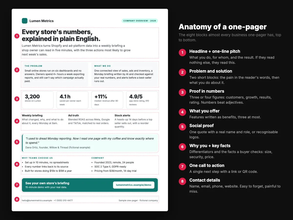
The layout around those blocks changes with the job. Four patterns cover almost every one-pager you will see:
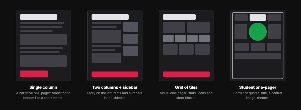
- Single column reads like a short memo. Good for project briefs and executive summaries.
- Two columns with a sidebar puts the story on the left and the facts and numbers on the right. The most common business layout.
- Grid of tiles is the visual one-pager: stats, icons and short blocks. Good for sales sheets and impact reports.
- The student layout has a border of quotes, the title at the top, a central image and short written responses around it.
For word counts per block and the right size for print and screen, see one-pager format: what to include.
Types of one-pagers
The skeleton stays; the emphasis moves. What a donor needs first is not what an investor needs first. Ten types cover nearly every one-pager written today:
| Type | Who reads it | Lead with | Must include |
|---|---|---|---|
| Company one-pager | Partners, press, new hires | What you do, in one line | Mission, offer, three key numbers, contact |
| Sales one-pager (sell sheet) | Prospects, buyers | The customer's problem | Benefits, proof, price or next step |
| Product one-pager | Buyers, users | The value, not the features | Three benefits, a screenshot, call to action |
| Investor or startup one-pager | Investors, accelerators | Traction or the insight | Problem, solution, market, traction, team, the ask |
| Project one-pager (brief) | Managers, sponsors | The decision needed | Goal, scope, timeline, budget, risks |
| Nonprofit one-pager | Donors, volunteers | The need and the impact | Impact numbers, a story, use of funds, ways to help |
| Event one-pager | Attendees, sponsors | Date, place, why attend | Speakers, agenda, price, how to register |
| Case study one-pager | Late-stage prospects | The result | Challenge, solution, metrics, a quote |
| Personal one-pager (resume) | Employers, clients | What you do best | Work samples, process, contact |
| Student one-pager | Teacher, classmates | Title and a central image | Quotes, theme, symbol, a personal connection |
Every type in that table has at least one worked example below.
6 printable one-pager examples
We designed these six as samples; the companies, people and numbers are invented, so you can copy the structure freely. Each one fits on US Letter and prints cleanly in color or black and white. Click any page to download it as a PDF.
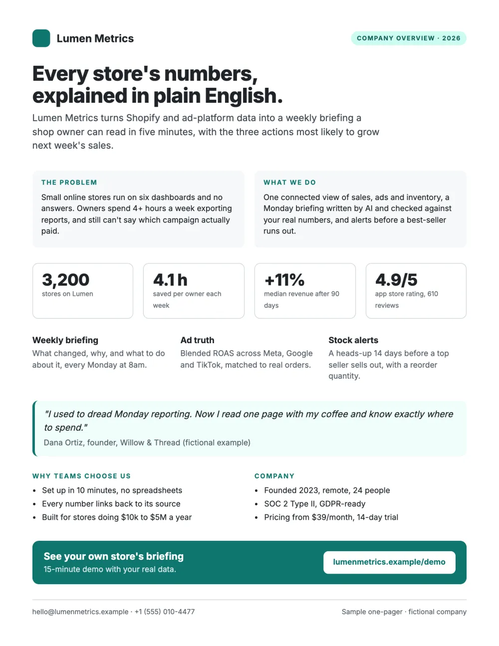
1. Company overview one-pager
The classic company one-pager for a fictional analytics startup: a headline that says what the company does in plain words, the problem and the solution side by side, four proof numbers, three features, one customer quote, the facts a buyer checks (team size, security, price) and a demo call to action.
Why it works
- The headline is a promise, not a slogan.
- Every number has a unit or a timeframe.
- The call to action spells out the URL, so it still works on paper.
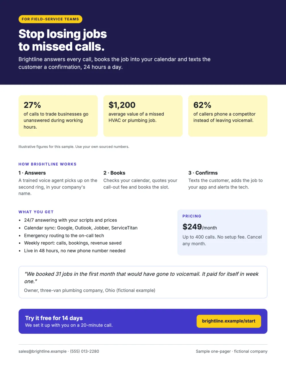
2. Sales one-pager (sell sheet)
A sell sheet for a phone-answering service. It opens on the cost of the problem, explains the product in three steps, lists what is included, shows the price and ends on a free trial. The three opening figures are placeholders in this sample: on a real sell sheet, cite where each number comes from.
Why it works
- Pain first, product second.
- The price is on the page; buyers trust a sheet that does not hide it.
- Three numbered steps make a service feel simple.
3. Investor one-pager
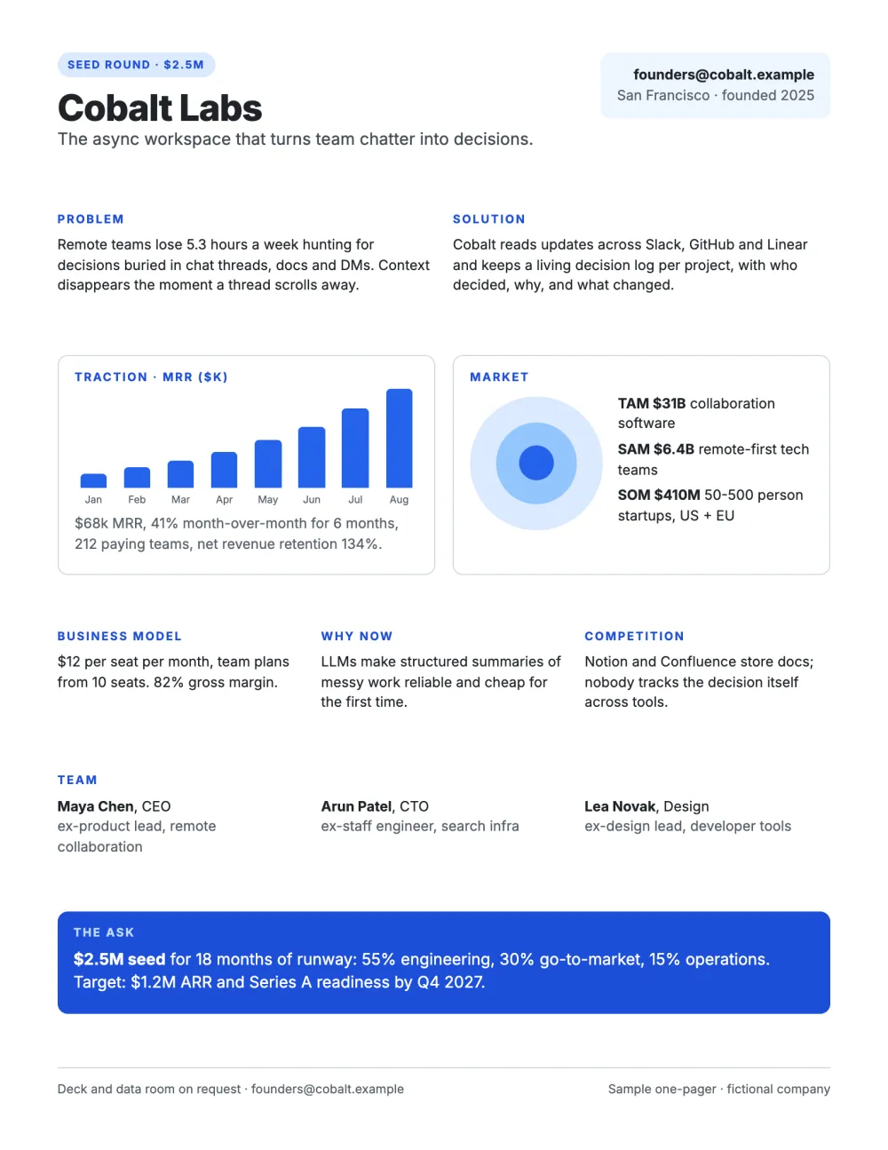
Everything an investor screens for on one page: problem, solution, a traction chart, market size (TAM, SAM, SOM), business model, why now, competition, team and the ask with the use of funds.
Why it works
- Traction is a chart, not a sentence.
- The ask is specific: amount, runway, how it is spent and the milestone it buys.
- Competition gets one honest line instead of being dodged.
4. Project one-pager (project brief)
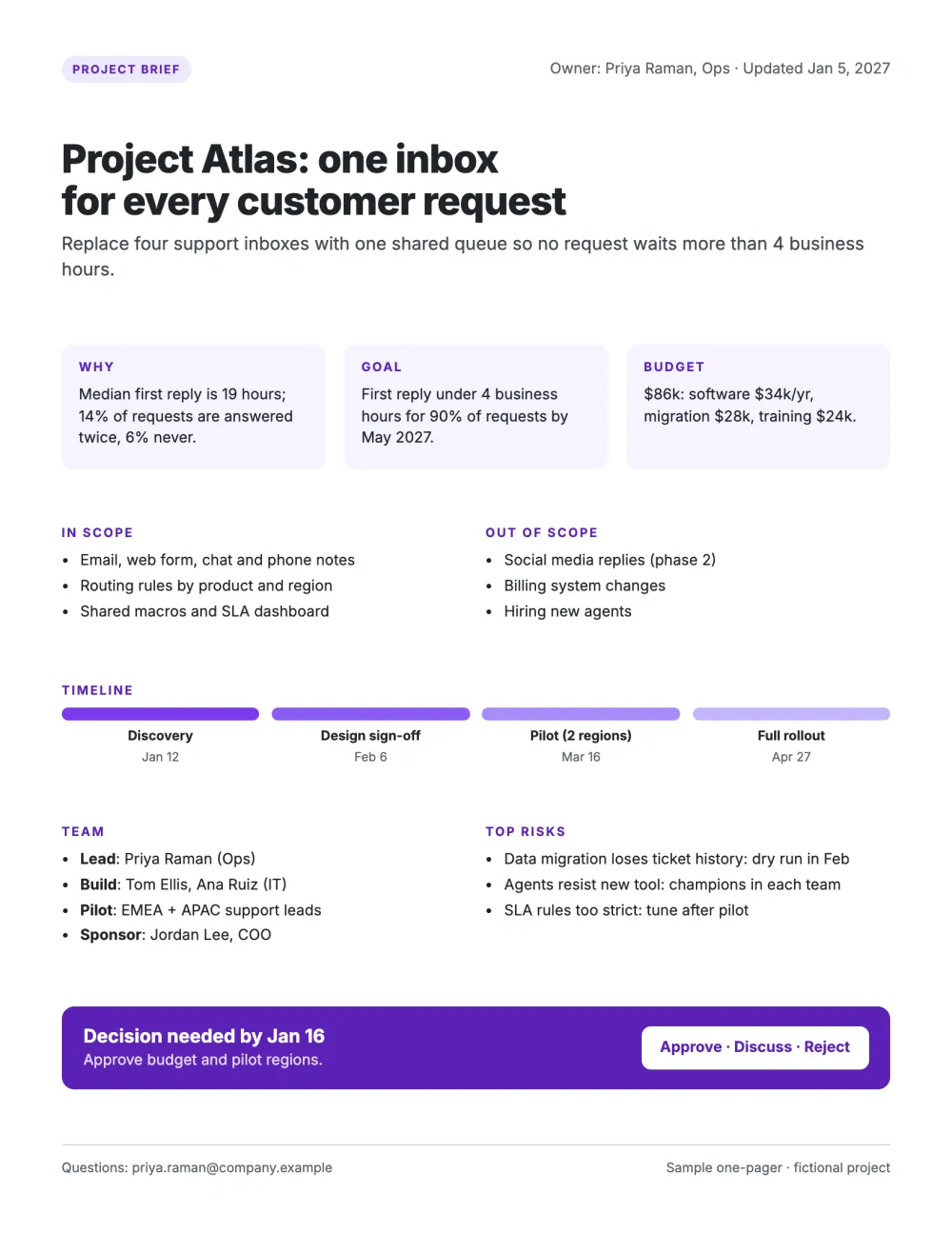
An internal brief built to get a decision: why the project matters, the goal, the budget, what is in and out of scope, a four-step timeline, the team, the top risks with their mitigations, and a decision deadline.
Why it works
- Out of scope is as explicit as in scope.
- Every risk carries its mitigation.
- It ends with the decision needed and the date it is needed by.
5. Nonprofit impact one-pager
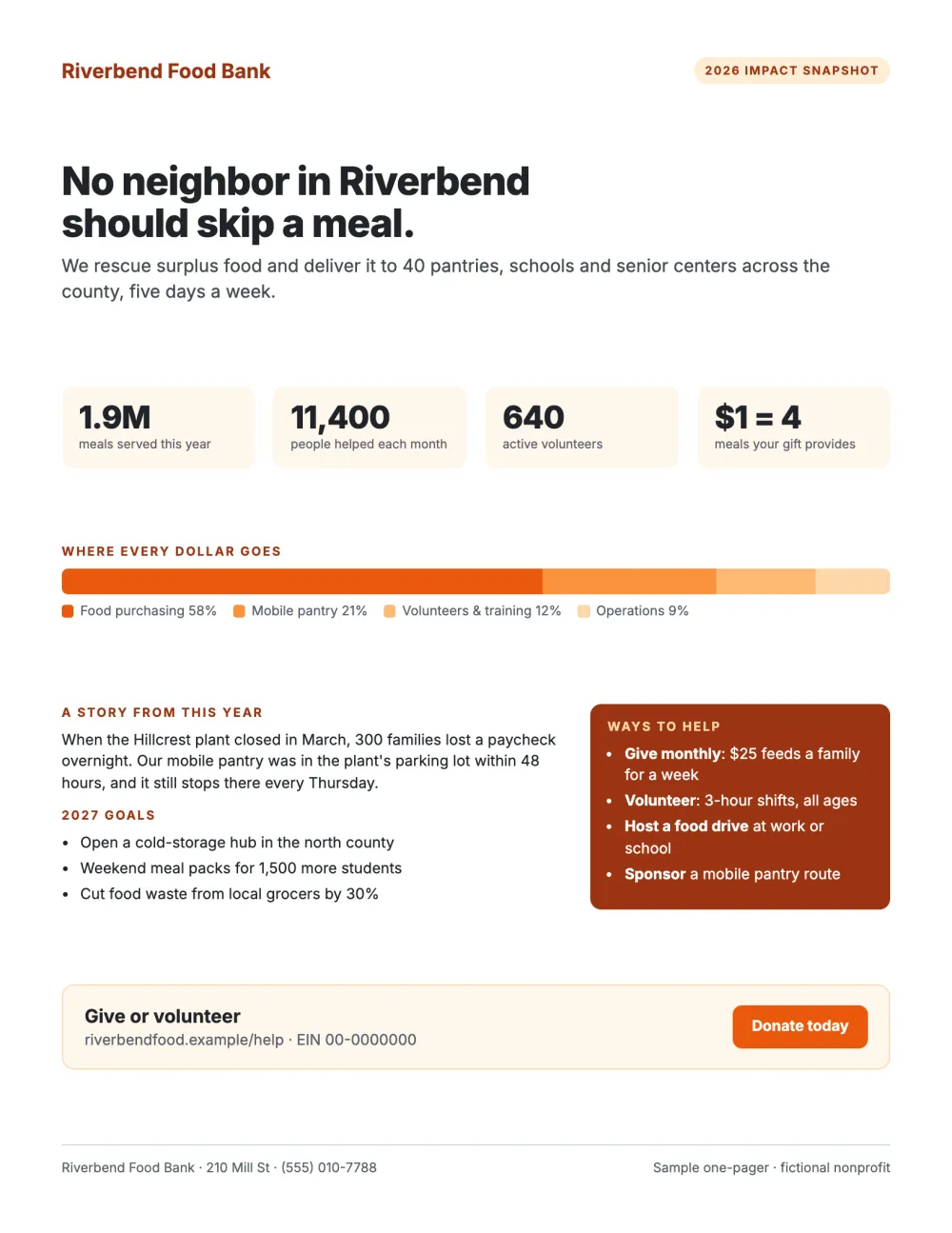
An impact snapshot for a fictional food bank: the need in one sentence, four impact numbers, a bar that shows where every dollar goes, one story from the year, next year's goals and four ways to help.
Why it works
- Use of funds is visual and adds up to 100%.
- One concrete story does more than five statistics.
- Several ways to help, from $25 a month to sponsoring a route.
6. Student one-pager (novel)
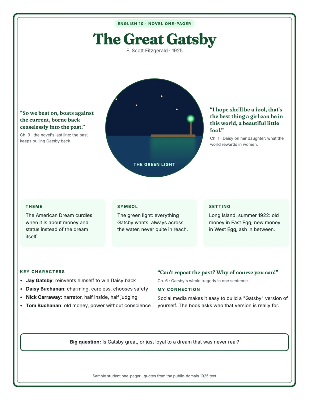
The format teachers assign after a novel or a unit: title and author, a central image (Gatsby's green light), quotes with chapter references, theme, symbol, setting, key characters, a personal connection and one big question. The quotes come from the public-domain 1925 text.
Why it works
- Every quote is explained, not just copied.
- The central image carries meaning, it is not decoration.
- The connection links the book to the student's own world.
15 interactive one-pager examples
A printed one-pager stops at the edge of the paper. An interactive one-pager is the same idea as a web page: one link, one scroll, with the headline, the numbers and each section revealed as the reader scrolls. It opens properly on a phone, it can carry video and live charts, you can fix a number after you have sent it, and you can see whether it was read.
The fifteen below are real templates built with Scrollytelling. Each image shows four moments of the scroll; open any of them in full, or start your own from it.
7. Investor one-pager
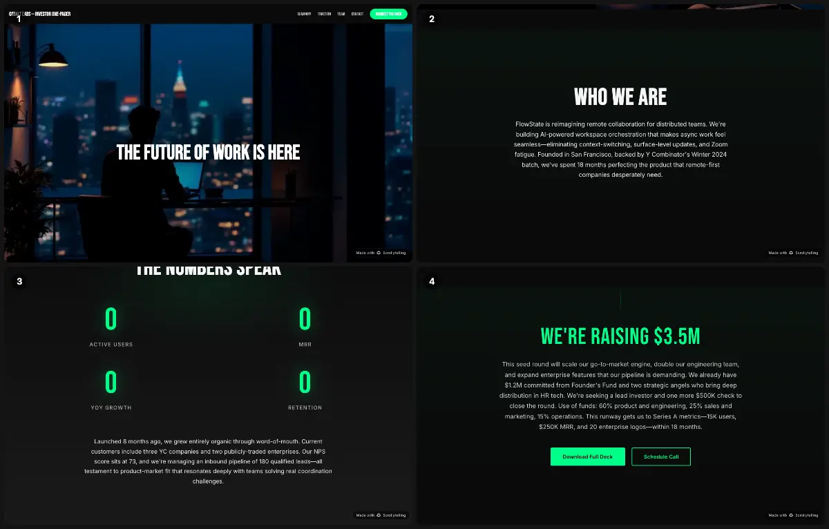
Cobalt Labs opens on a single line ("The future of work is here"), then who they are, the problem ("Async is broken"), the product and its features, the numbers and the founding team. The navigation doubles as the investor's checklist: Summary, Traction, Team, Contact.
Steal this: Put the ask in the header. "Request the deck" stays on screen for the whole scroll.
8. Startup pitch one-pager
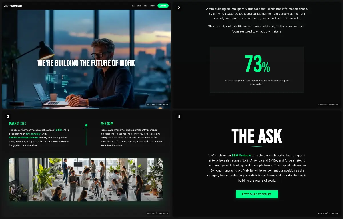
A pitch in miniature: the idea, the market and why now, the technical edge, the founding team, then early traction with named customers. It is the link you send before a pitch meeting so the first ten minutes are not spent on basics.
Steal this: Give "Why now" its own section. It is the question every investor asks first.
9. Product one-pager
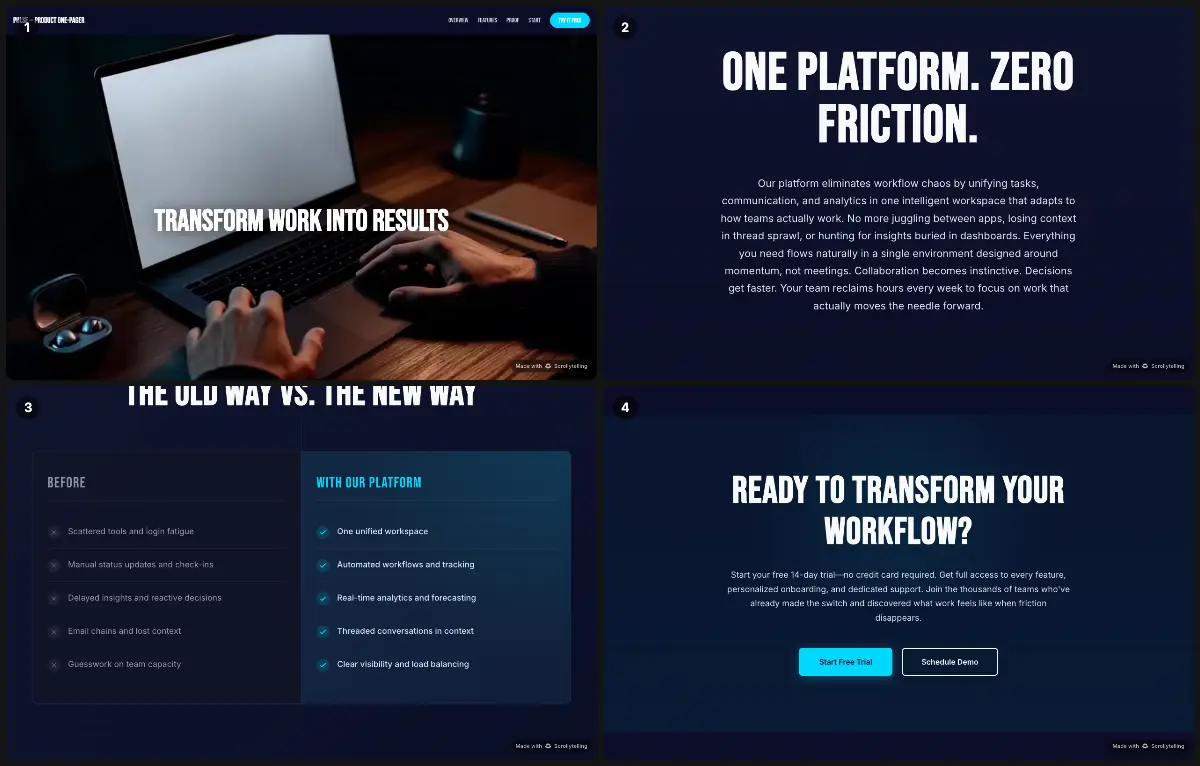
Pulse leads with the outcome ("Transform work into results"), then three capabilities with one sentence each, a row of customer names, an old way vs new way comparison and a closing call to action.
Steal this: The old way vs new way block does the selling in a single glance.
10. App one-pager
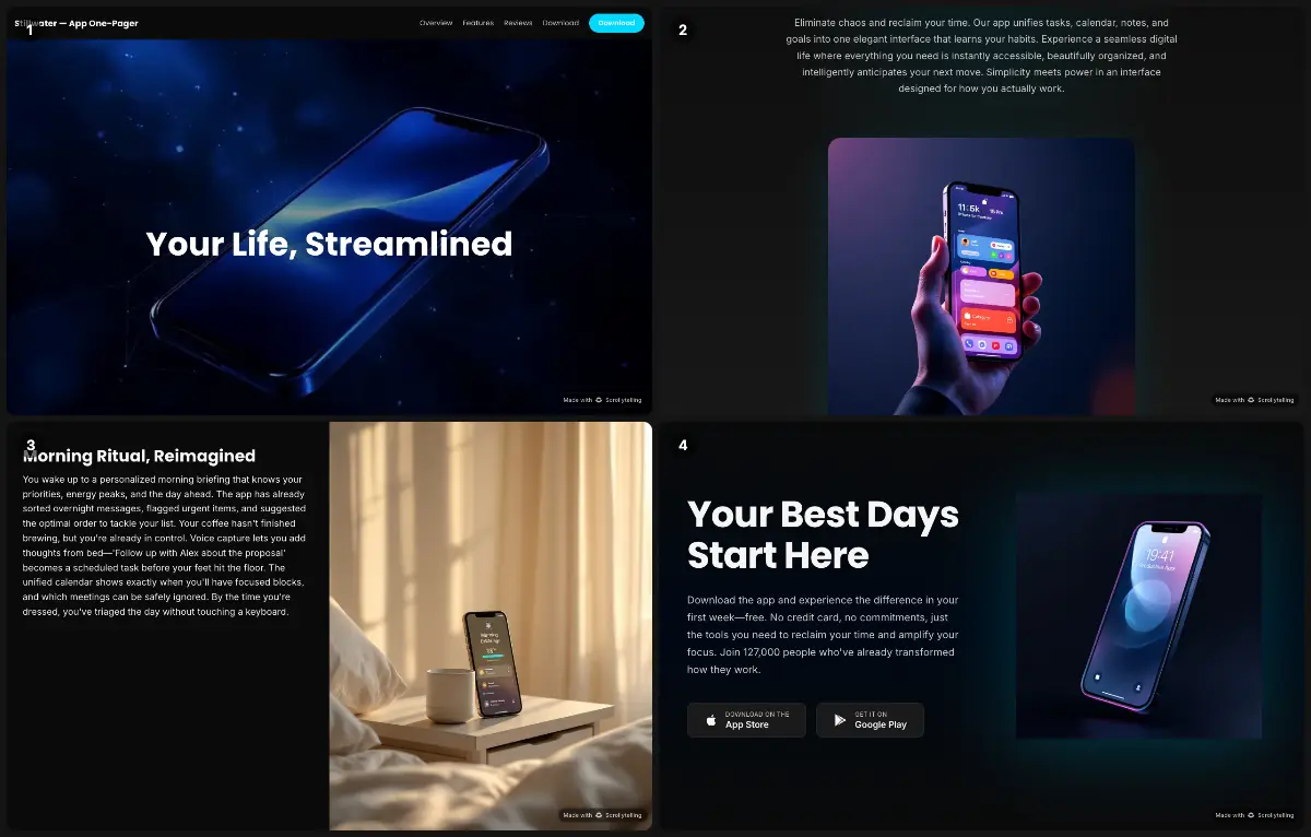
Stillwater is built around a day in the user's life: a morning ritual, the workday, the evening wind-down, with six features in between and download buttons for both app stores at the end.
Steal this: Show the product inside a routine, not as a feature list.
11. Service one-pager
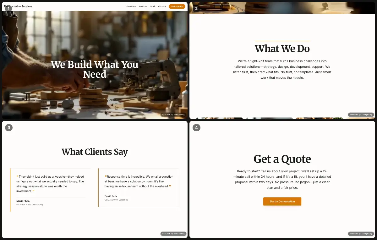
What we do (six services), how we work (discovery, proposal, delivery) and two client results with real numbers ("127% revenue growth"), ending on "Get a quote".
Steal this: A three-step "How we work" answers the buyer's real question: what happens if I say yes?
12. Sales one-pager
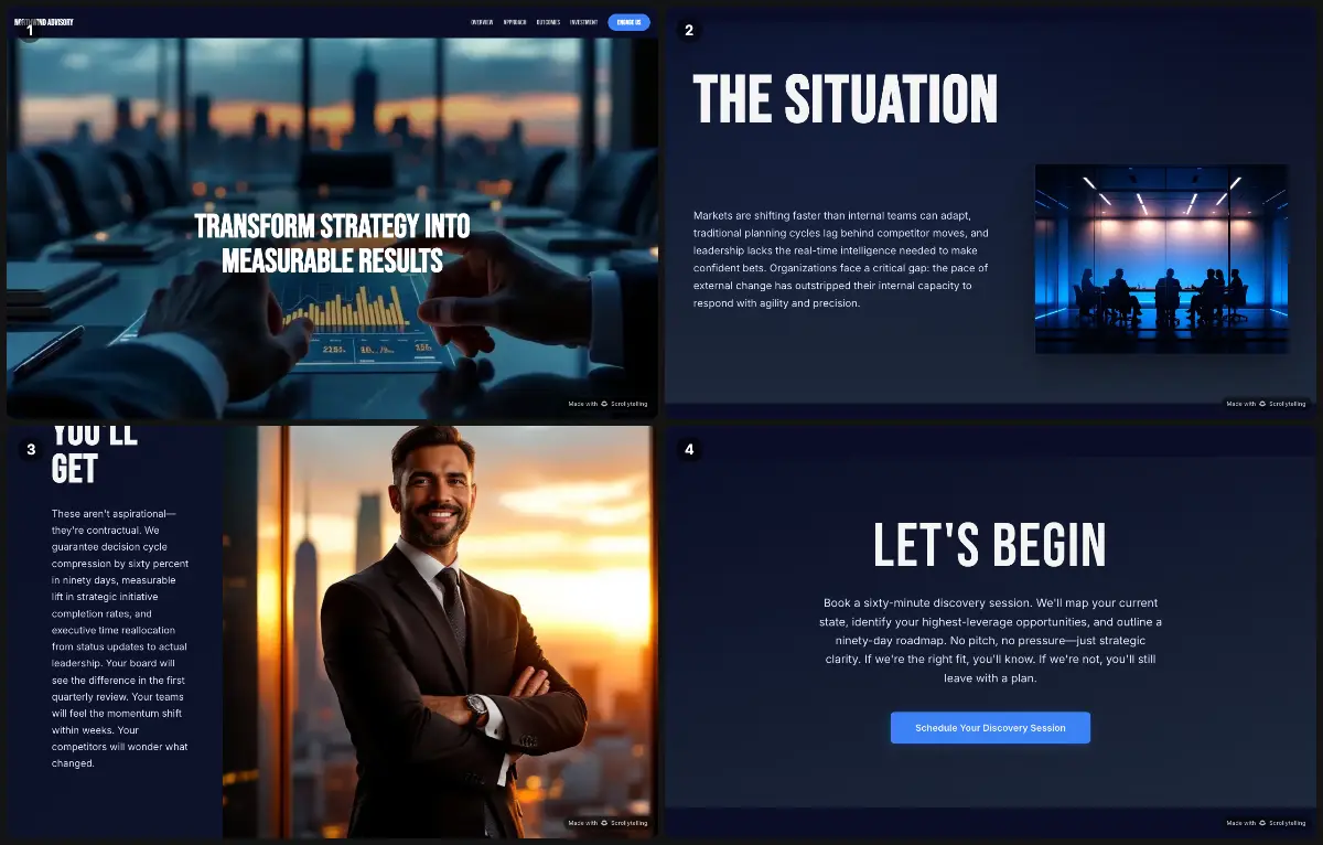
A consulting sell sheet: the situation (four pains named one by one), the approach in three phases, the outcomes in measurable terms and a call to book a discovery session.
Steal this: Name the reader's problems in their own words before you mention yourself.
13. Company one-pager
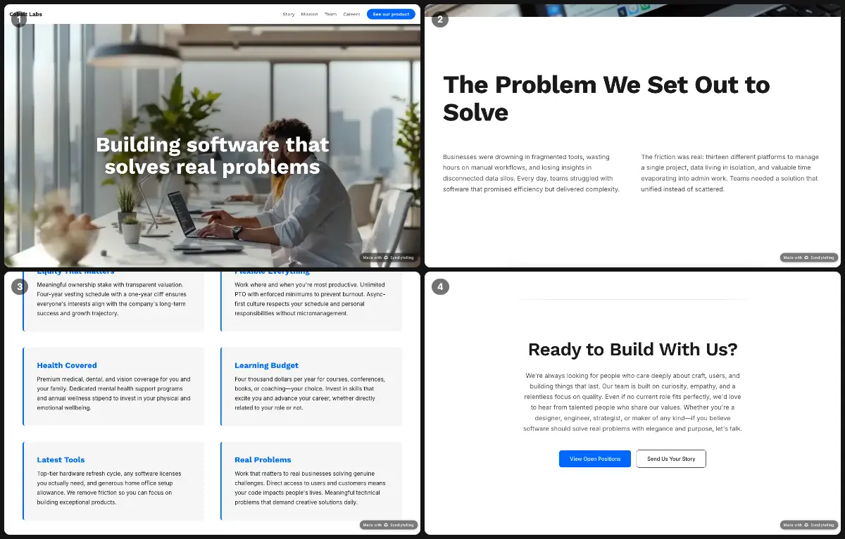
The company story on one scroll: the problem the founders set out to solve, the mission and values, how the team works and who is on it, with a link to the product at the end.
Steal this: Values with a one-line example each read as real, not as poster slogans.
14. Case study one-pager
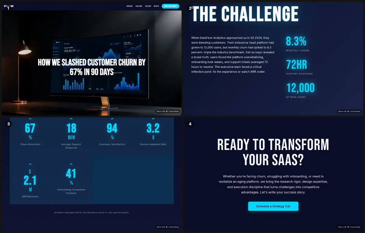
The headline is the result ("How we slashed customer churn by 67% in 90 days"), followed by the challenge, the four moves that got there, the results, key metrics and the lessons learned.
Steal this: Put the number in the headline. Most readers stop there.
15. Executive summary one-pager
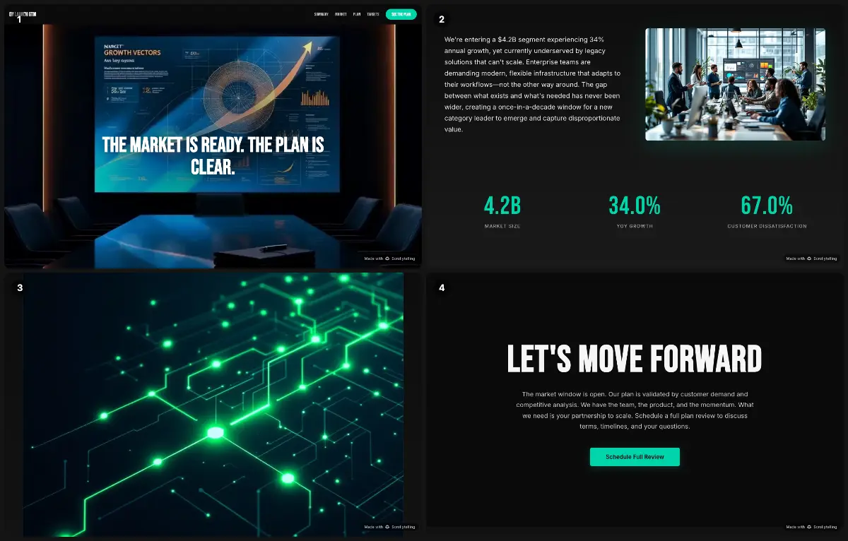
A go-to-market plan reduced to its spine: the opportunity (four market drivers), the plan in three phases, the target segments and why the team will win.
Steal this: Open with the conclusion: "The market is ready. The plan is clear."
16. Event one-pager
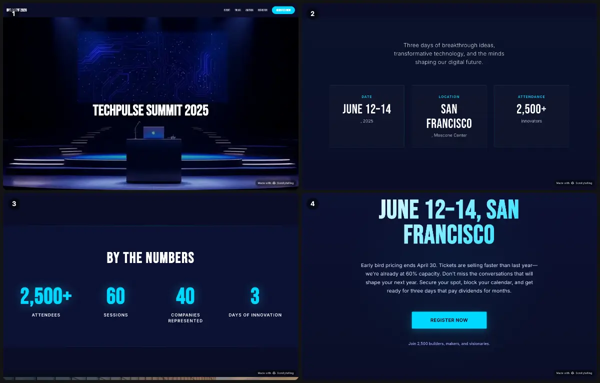
Everything an attendee needs before they register: why come, the headline speakers, the tracks and the agenda, with a register button that stays in the header.
Steal this: Faces sell events. Put the speakers before the agenda.
17. Nonprofit one-pager
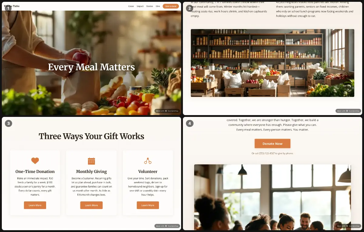
Fill the Table starts with the need, then shows how each dollar multiplies, the people behind the numbers, a seasonal goal (500,000 meals) and three ways to give.
Steal this: A single dated goal gives donors a reason to act now rather than later.
18. Product launch one-pager
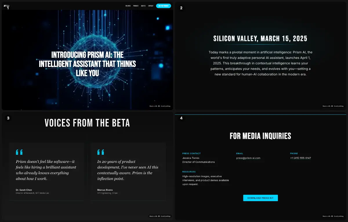
A launch page in press-release form: a dateline, what the product is, why it matters, the features, quotes from beta users and the public launch date.
Steal this: Beta-user quotes make a launch credible before anyone has bought it.
19. Personal one-pager (resume)
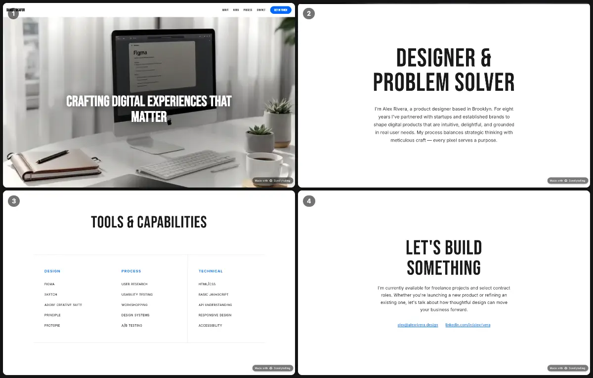
A product designer's one-page portfolio: who he is, four projects, how he works step by step, his tools and a contact button.
Steal this: Show the process, not only the finished screens. Clients hire how you work.
20. Year-in-review one-pager
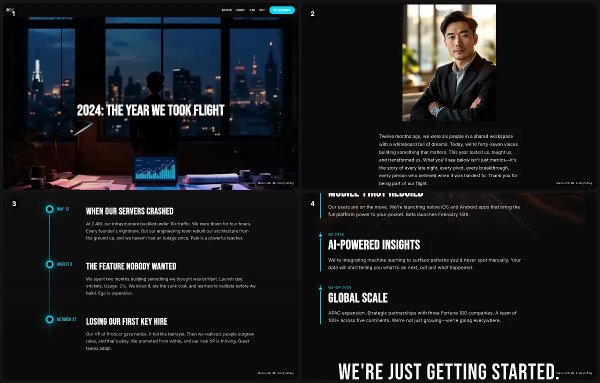
A founder's letter, then the year's milestones (first enterprise client, version 2.0, Series A, expansion to EMEA), the team by function and, unusually, the hard lessons.
Steal this: A "hard lessons" section earns more trust than one more win.
21. Project plan one-pager
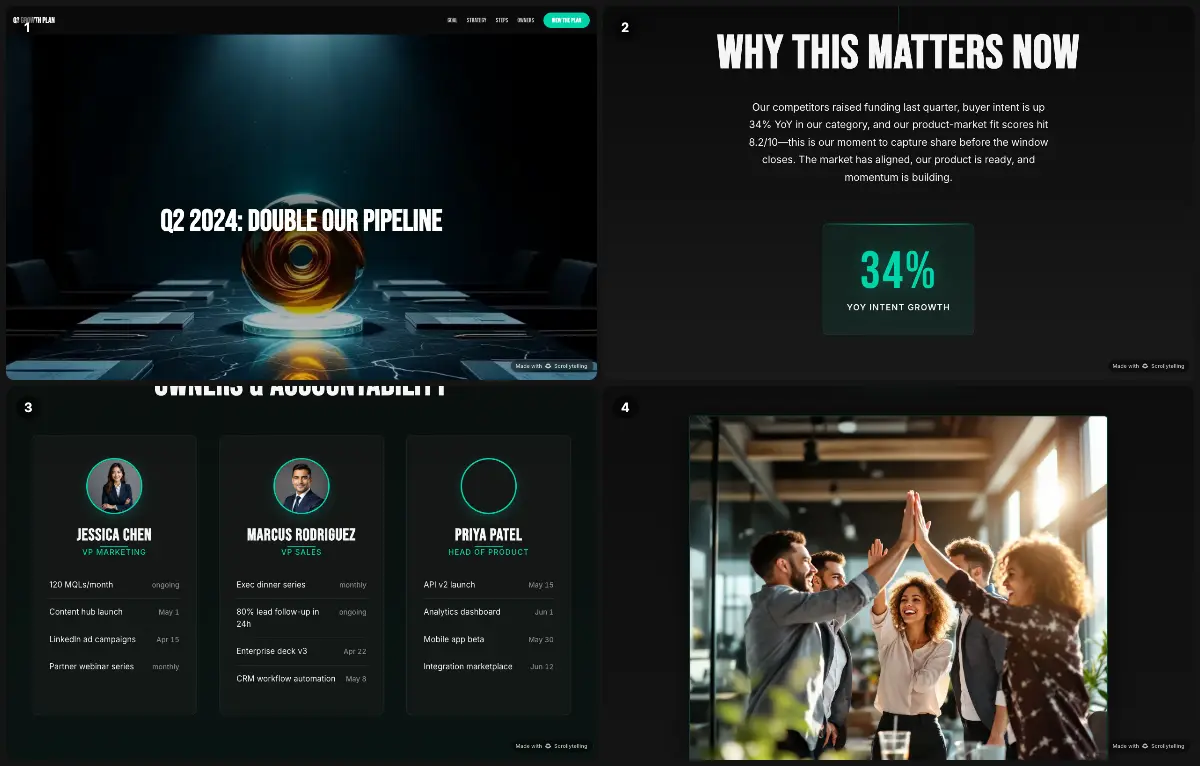
One goal ("Double our pipeline"), why it matters now, three workstreams, a 90-day timeline broken into two-week sprints, and the owners.
Steal this: A timeline in weeks with an owner per line turns a plan into commitments.
One-pager ideas
Not sure what to make? Here are 30 one-pager ideas, grouped by who usually makes them, with what to put on each.
For business
- Company overview: mission, offer, three numbers, contact.
- Sell sheet for one product: pain, benefits, price, trial.
- Investor teaser: traction chart, market, team, the ask.
- Partnership proposal: what each side gets, a first joint project.
- Release notes: what is new, who it is for, how to try it.
- Customer case study: the challenge, the fix, one big number.
- Project brief: goal, scope, timeline, the decision needed.
- Quarterly update: three wins, one miss, next quarter's focus.
- Sponsorship pack: audience, packages, deadlines.
- Hiring one-pager: the role, the team, why join, how to apply.
- Speaker or expert bio: topics, past talks, booking contact.
- Media kit: boilerplate, key facts, logos, press contact.
For nonprofits and communities
- Impact snapshot: the year in four numbers and one story.
- Campaign appeal: one goal, a deadline, what each gift does.
- Volunteer recruitment: roles, time needed, how to sign up.
- Grant summary: need, approach, budget, measurable outcomes.
- Community event: what, when, where, who it is for.
For school: ideas for teachers and students
- Novel or short story: title, central image, quotes, theme, symbol.
- Character study: traits backed by quotes, how the character changes.
- Poem: key lines, imagery, tone, structure.
- Historical figure: dates, achievements, a quote, legacy.
- Historical event: causes, a mini timeline, effects, a primary-source quote.
- Science concept: definition, a labelled diagram, a real-world example, vocabulary.
- Biography: turning points, influences, why the person matters today.
- Current event: the facts, two viewpoints, your own view.
- Research summary: question, method, findings, sources.
- Country or culture: map, facts, traditions, a phrase in the language.
- Math concept: the rule, a worked example, a common mistake.
- Book report for younger readers: favorite part, characters, a star rating.
- "All about me": a first-week-of-school one-pager to introduce yourself.
Teachers: the free student one-pager template further down prints on Letter and works for every school idea above.
How to make a one-pager in 6 steps
Pick one reader and one action
Who will read it, and what should they do next? Book a demo, take a call, approve a budget, give.
Collect the facts
Numbers, a customer quote, logos, the price, the deadline, the contact details.
Write the headline
What you do, for whom, with what result, in twelve words or fewer.
Write short blocks
Problem, solution, proof, offer, why you, call to action: 250 to 500 words in total.
Lay it out
Headline biggest, numbers next, two fonts at most, one accent color, plenty of white space.
Test it
Give it to someone for ten seconds. If they cannot say what you do and what you want, cut and rewrite.
The full walkthrough, with a worked example, a tool comparison and a version for students, is in how to make a one-pager.
One-pager design tips, and mistakes to avoid
Do
- Make the headline the biggest thing on the page.
- Use numbers with units and dates.
- Pick one accent color and use it only for what matters.
- Group with white space instead of lines and boxes.
- Write benefits, not features.
- Use real photos or product shots over stock.
- Keep body text at 10 pt or larger in print, 16 px on screen.
- End with one call to action and print the link in full.
Avoid
- Squeezing the whole brochure onto one page.
- Three different calls to action.
- Paragraphs longer than four lines.
- Jargon and acronyms the reader will not know.
- Statistics without a source.
- Forgetting the contact details.
- Shrinking the type to fit more in.
One-pager size and format
| Format | Page size | Pixels at 300 dpi | Best for |
|---|---|---|---|
| US Letter | 8.5 × 11 in | 2550 × 3300 px | Printing in the US and Canada |
| A4 | 210 × 297 mm | 2480 × 3508 px | Printing everywhere else |
| Screen PDF or image | Letter or A4 ratio | 1275 × 1650 px is enough | Email attachments, chat |
| Interactive (web page) | One responsive scroll | Fits any screen | Links, phones, video, updates after sending |
For print, keep margins of at least 0.5 in (12 mm) and stay between 250 and 500 words. For email, save a PDF. If most readers will open it on a phone, a PDF is the weakest format: send a link to a web one-pager instead. Margins, type sizes and file formats in detail: one-pager size and dimensions.
Free one-pager templates
Two blank templates to print and fill in, by hand or digitally. Both are US Letter PDFs and free to use, including in class and for client work.
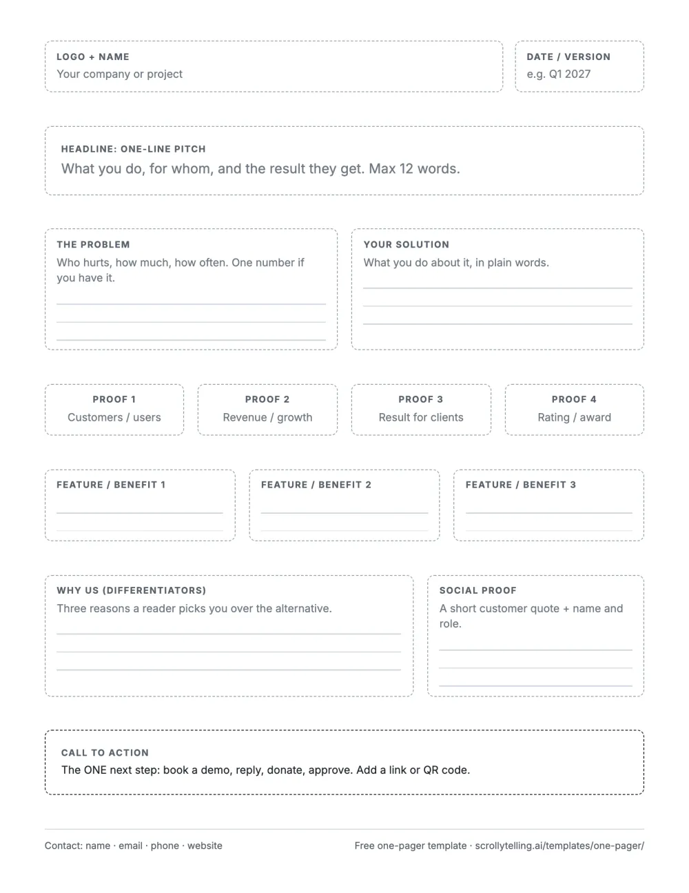
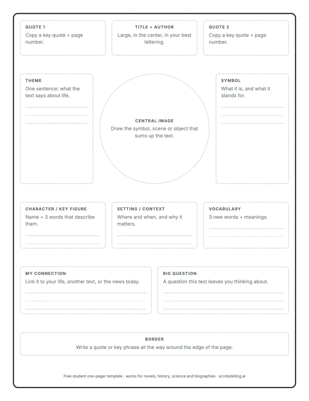
Prefer to edit in the browser and share a link? The one-pager templates page has interactive templates for investor, startup, product, app and service one-pagers, and the free one-pager maker writes a first draft from one sentence.
Frequently asked questions
What is a one-pager?
A one-pager is a single page that summarizes a business, product, project, pitch or topic so a reader grasps the essentials in about a minute. It typically includes a headline, the problem and the solution, proof, and one call to action.
What does a one-pager look like?
A headline at the top, two to four short blocks of text, a row of key numbers, often an image or a chart, and a call to action with contact details at the bottom. The anatomy diagram and the 21 examples on this page show the variations.
How long should a one-pager be?
One side of US Letter or A4, usually 250 to 500 words. If it needs a second page, it has become a brochure or a report.
What should a one-pager include?
A headline and one-line pitch, the problem, the solution, proof (numbers, logos, a quote), what makes you different, one call to action and contact details. Student one-pagers swap these for the title, a central image, quotes, the theme and a personal connection. More in what to include in a one-pager.
What is a one-pager in school?
An assignment where students summarize a book, topic or lesson on a single page using an image, key quotes and short written responses. It shows understanding visually and is quick to share and grade.
What is the difference between a one-pager and an executive summary?
An executive summary condenses a longer document and sits on top of it. A one-pager stands on its own as the first thing someone reads about you.
Is a one-pager the same as a one-page website?
No. A one-pager is a document; a one-page website is a whole website on a single scrolling page. See what a one-page website is.
What is the best free tool to make a one-pager?
Google Docs or Word for text-led one-pagers, Canva or Google Slides for visual ones, and Scrollytelling for interactive one-pagers you share as a link. The tool comparison covers each.
Can a one-pager be interactive?
Yes. An interactive one-pager is a single web page: one link that opens on any device, can include video and charts, can be updated after sending and shows whether it was read.