Why publish a case study as an interactive page
A case study shows a buyer that a company like theirs had the same problem and got a measurable result. Format decides whether they get that far.
- It is a link, not an attachment. Sales pastes it into an email or a proposal. It opens in one tap on a phone, with nothing to download or zoom.
- Time on page becomes measurable. On your own site, analytics shows how long people stayed and how far they scrolled. An emailed PDF tells you nothing.
- The proof is built to be seen. Results in big type, a named quote, a before/after chart. A buyer who only skims still sees the result.
- It can be updated. When the client's numbers improve, you edit the page and every link already sent shows the new figure.
"Interactive" does not mean a game. Below, it means short sections paced by scrolling, large numbers, full-width imagery or video, and sometimes motion tied to the scroll.
12 interactive case study examples
We read each page top to bottom in November 2026. None were built with Scrollytelling; they are here because they do the job well.
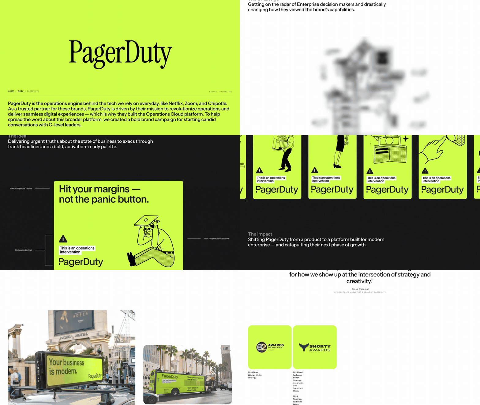
1. Instrument × PagerDuty
Visit site ↗What's on the page: PagerDuty's "Operations Intervention" campaign for C-level tech leaders in four parts: The Challenge, The Idea, The Impact, Our Role, with full-width campaign art between them. The Impact says it outperformed previous brand campaigns by 37% and quotes Jesse Purewal, VP Corporate Marketing & Brand.
Worth copying: Four plain headings, then one number and one named quote.
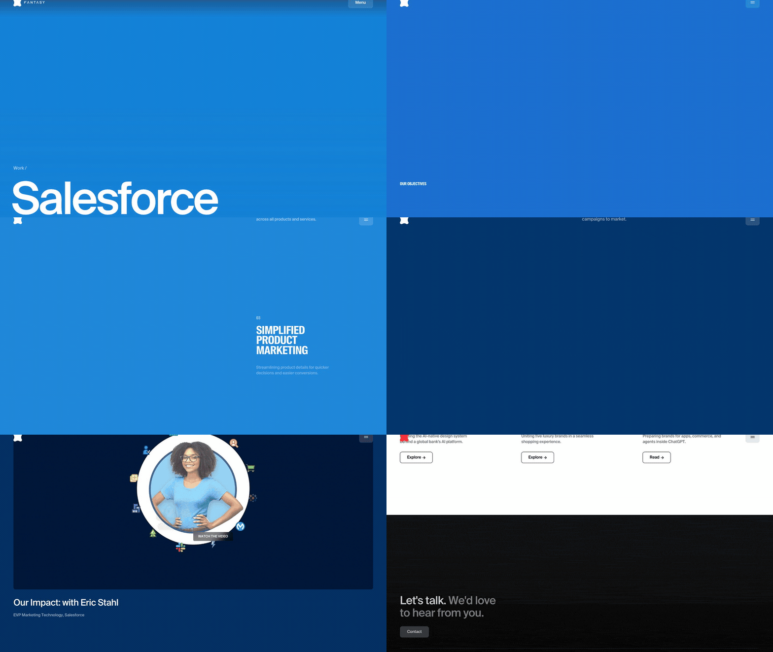
2. Fantasy × Salesforce
Visit site ↗What's on the page: Merging Salesforce's 40+ disconnected web properties into one ecosystem with a design system and Page Builder. Four numbered objectives open it; The Impact ends on two big figures, 85% and 40+, beside the name of Eric Stahl, EVP Marketing Technology. Scrolling runs on the Lenis library.
Worth copying: Numbered objectives up top that the results answer.
Watch out for: The 85% is the share of webpages on the new system in the text, but organic traffic in the stat label.
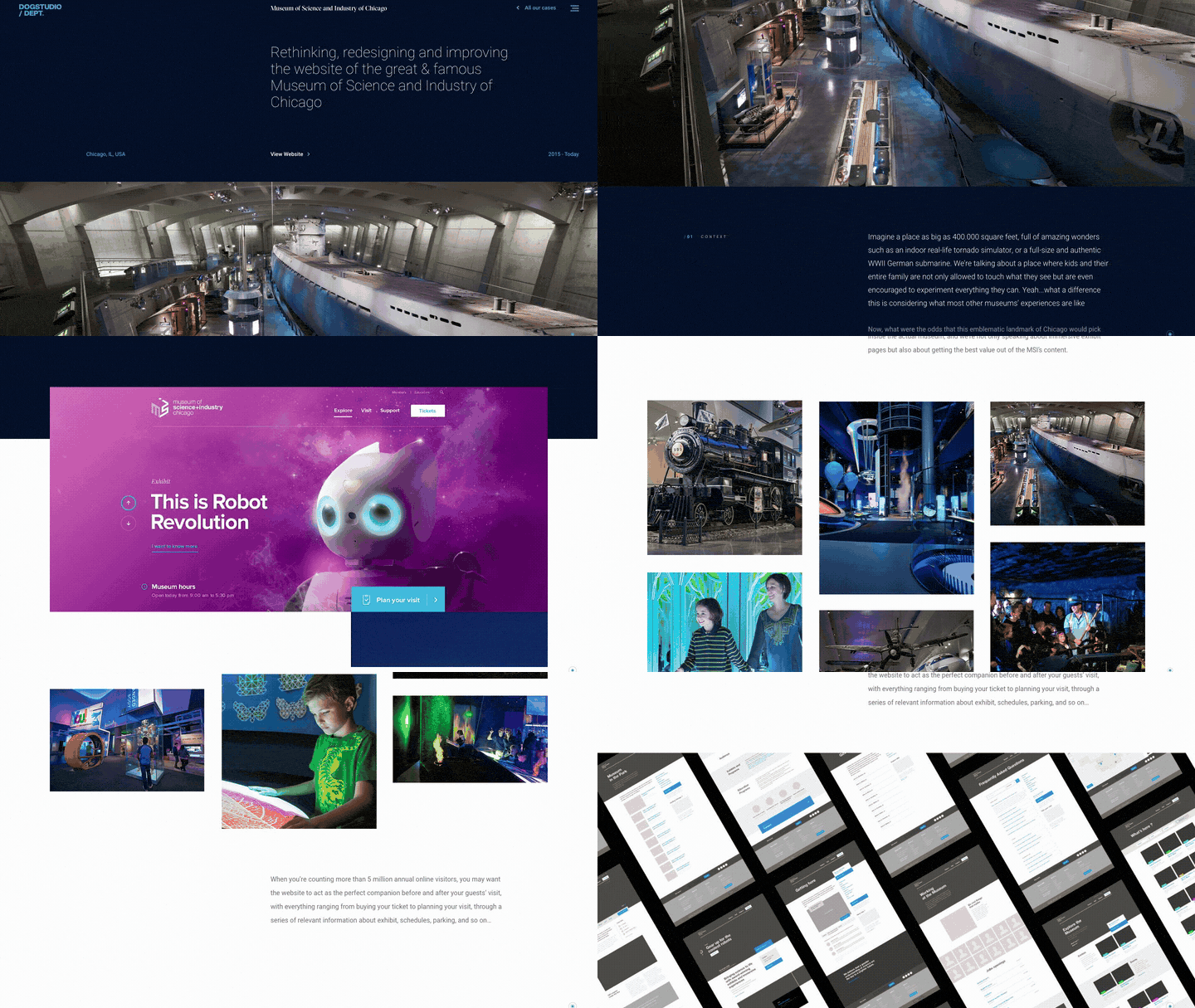
3. Dogstudio × Museum of Science and Industry, Chicago
Visit site ↗What's on the page: The museum's website redesign ("2015 - Today") in chapters numbered like a report, from /01 Context through Illustration (cinemagraph exhibit headers) to /09 Outcomes: 16% more visit intent, a 35% rise in online sales, and a quote from Steven Beasley, Director of Digital Media.
Worth copying: Numbered chapters work as a visible table of contents.
Watch out for: Neither number has a baseline or a timeframe.
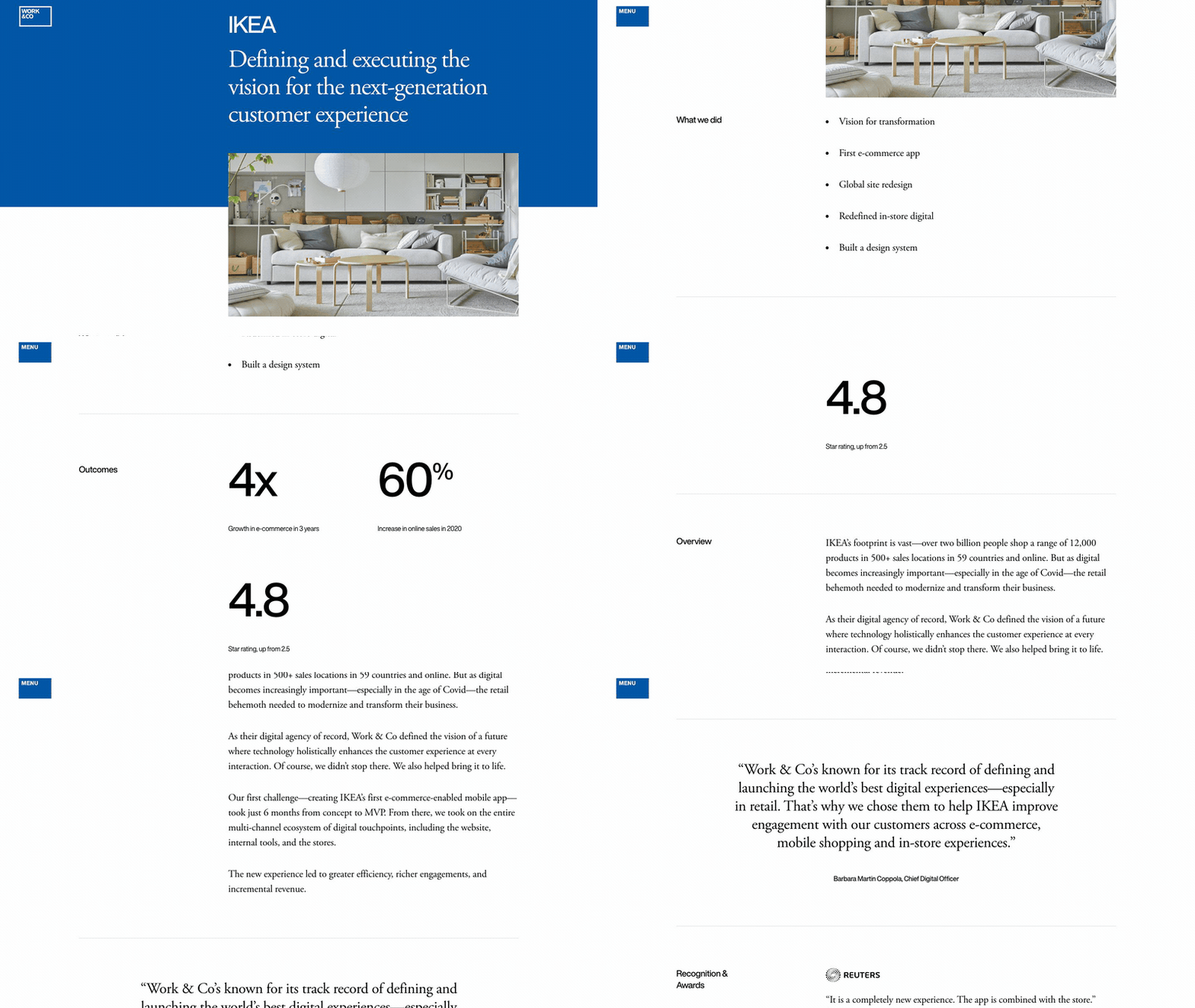
4. Work & Co × IKEA
Visit site ↗What's on the page: "Outcomes" sits right under the title: 4x e-commerce growth in 3 years, a 60% increase in online sales in 2020, a 4.8 star rating up from 2.5. Then a quote from Chief Digital Officer Barbara Martin Coppola, press quotes, awards and "4 Big Takeaways".
Worth copying: Results before the story, and "up from 2.5" gives the 4.8 a baseline.
5. Locomotive × Scout Motors
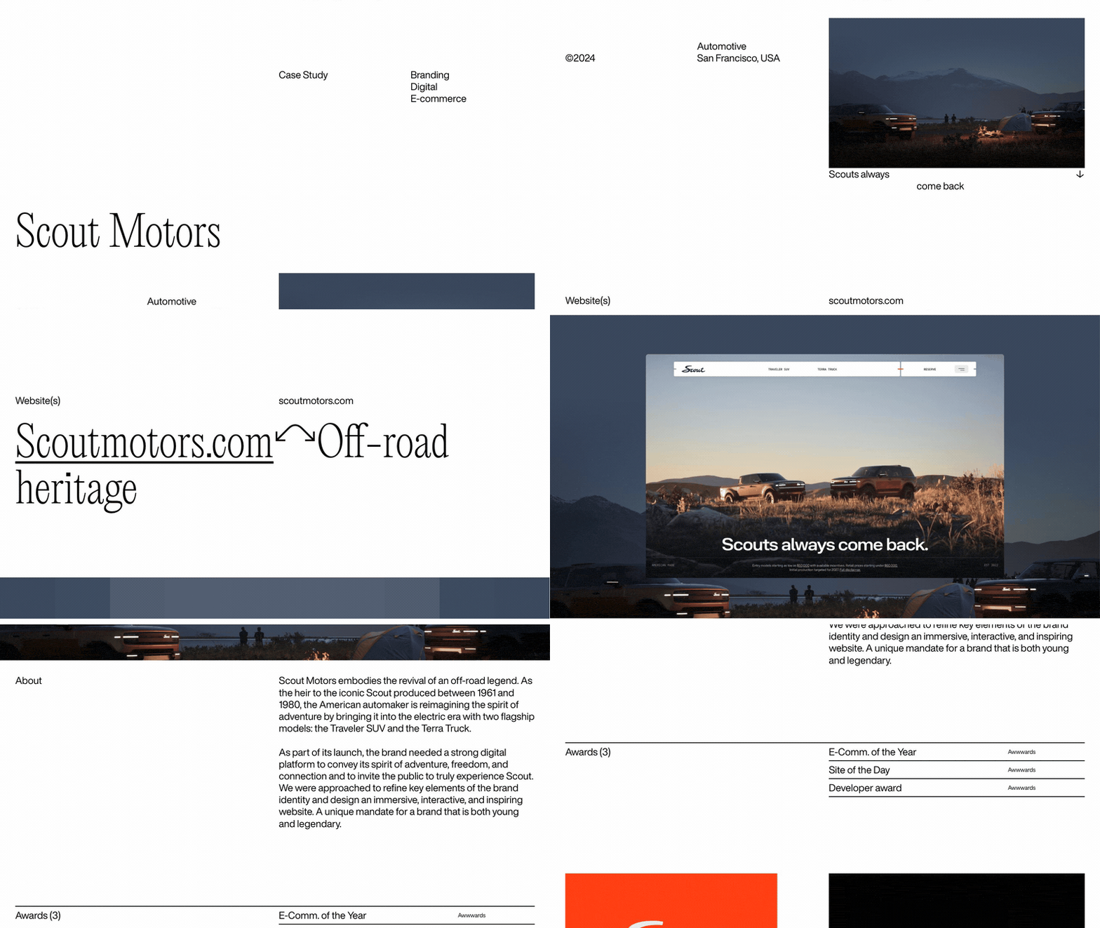
Visit site ↗What's on the page: The Montreal studio's page for the Scout Motors launch site (2024): a short About, three Awwwards awards including Site of the Day, then a long run of full-width imagery. The markup uses Locomotive Scroll, the studio's own open-source scroll library.
Worth copying: When the work is visual, let the scroll show it at full width.
Watch out for: No result numbers, no client quote. It proves craft, not outcomes.
6. Stripe × Jobber
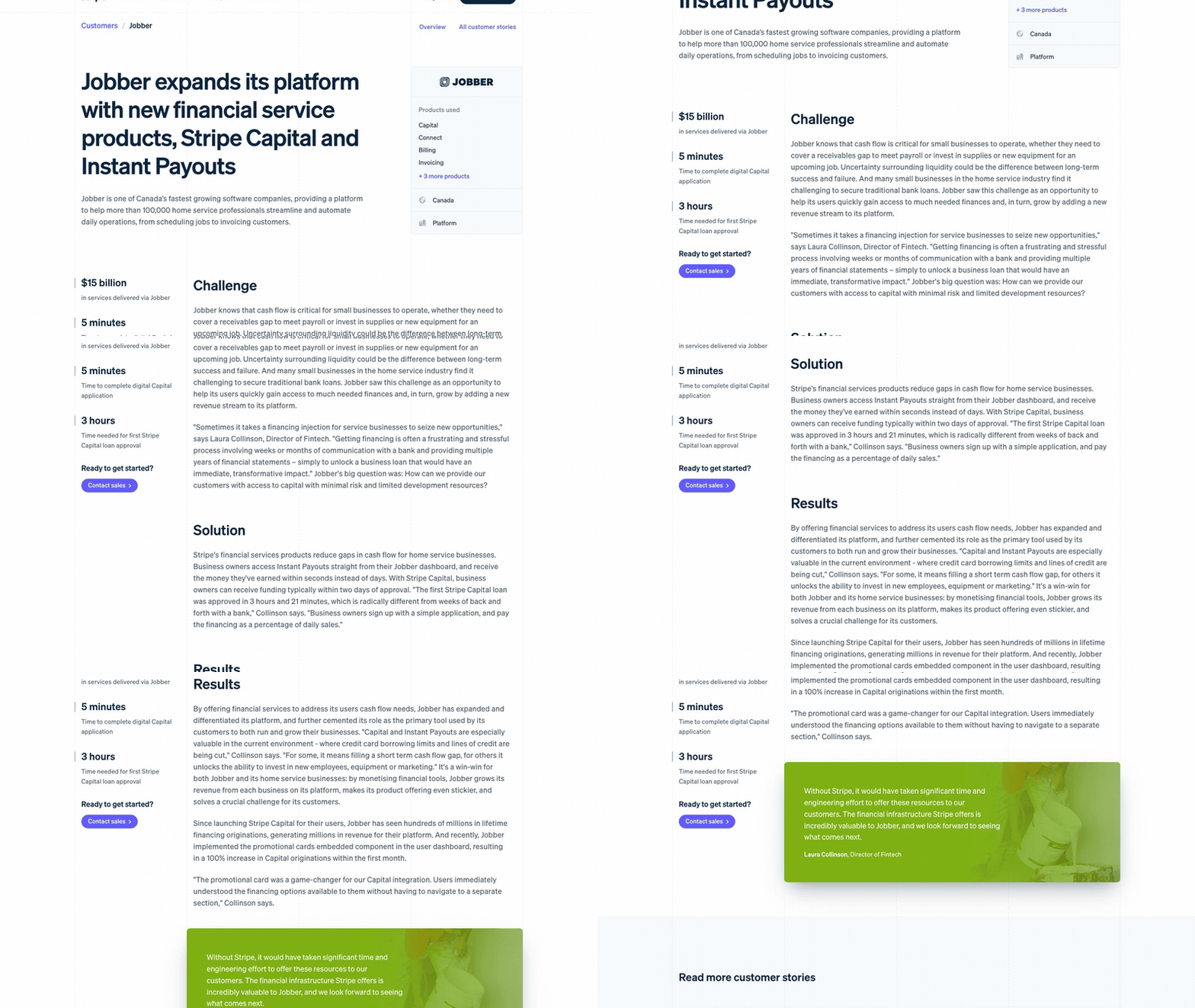
Visit site ↗What's on the page: Jobber adding Stripe Capital and Instant Payouts for home service businesses. Three stat blocks, then Challenge, Solution and Results, including a 100% rise in Capital originations in the month after a dashboard promo card. A pull quote from Laura Collinson, Director of Fintech, closes it.
Worth copying: Three headings only. The most compact version of the structure here.
Watch out for: Round claims ("hundreds of millions") convince less than the exact "3 hours and 21 minutes".
7. Shopify × Diptyque
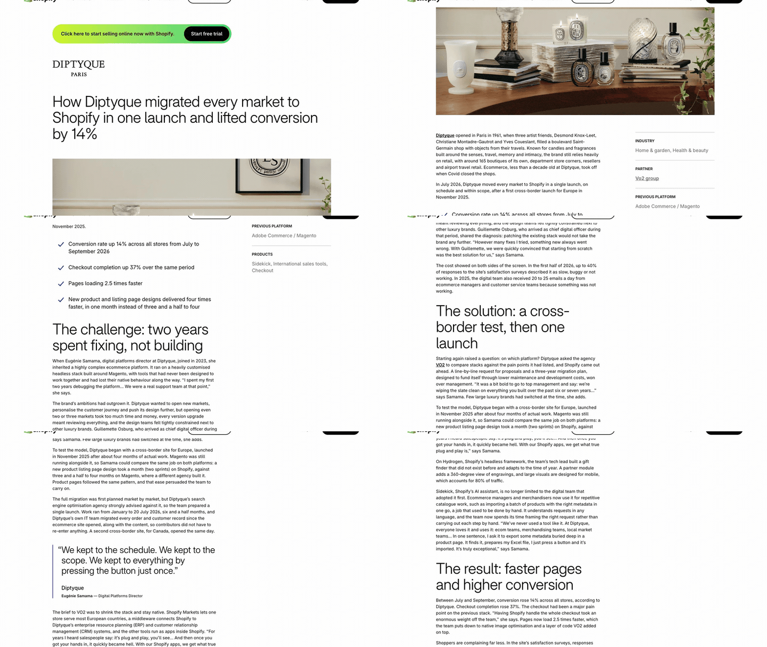
Visit site ↗What's on the page: The Paris fragrance house moving every market to Shopify in one launch, with agency VO2 Group. The headline carries the result; the lines under it give the period: conversion up 14% and checkout completion up 37%, July to September 2026. Headings state their point: "The challenge: two years spent fixing, not building".
Worth copying: Read only the headings and you have the story. It also says what is not measured yet.
8. Intercom × Atlassian
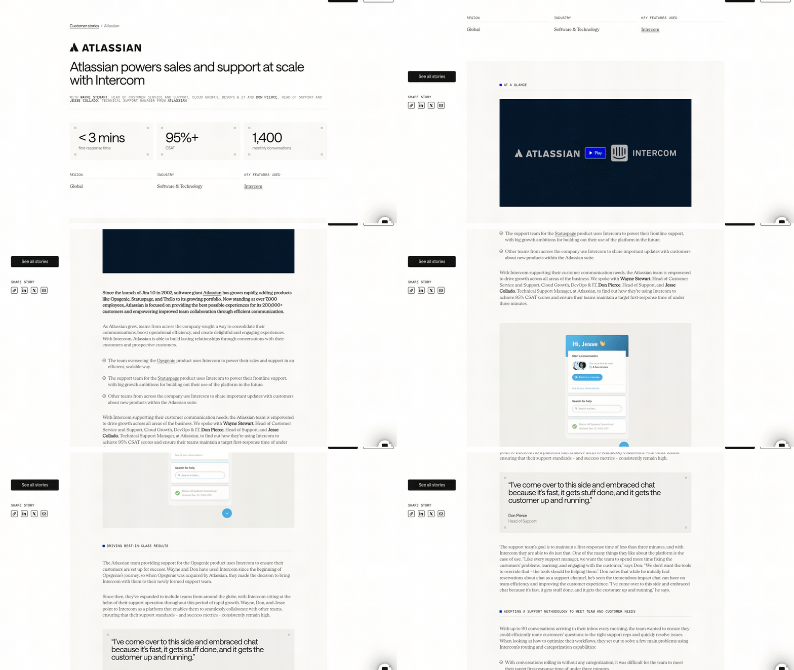
Visit site ↗What's on the page: Three people from Atlassian's support team credited under the title, then three stats: under 3 minutes first response, 95%+ CSAT, 1,400 monthly conversations. Then "At a glance", a video, screenshots of the team's inbox setup and named quotes.
Worth copying: Screenshots of the real setup show how the result happened.
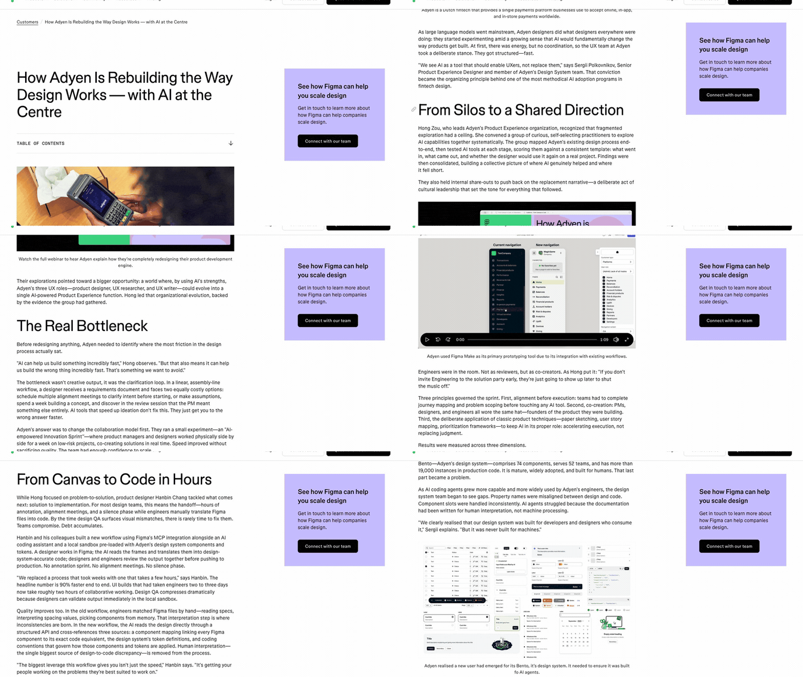
9. Figma × Adyen
Visit site ↗What's on the page: Adyen rebuilding its design process around AI, in six sections. Design-to-code is 90% faster; UI builds dropped from two to three days to about two hours. A screenshot shows Adyen's Bento design system, and several Adyen designers are quoted.
Worth copying: The screenshot sits right where the numbers describe the product.
Watch out for: So many figures that the headline result competes. Lead with three.
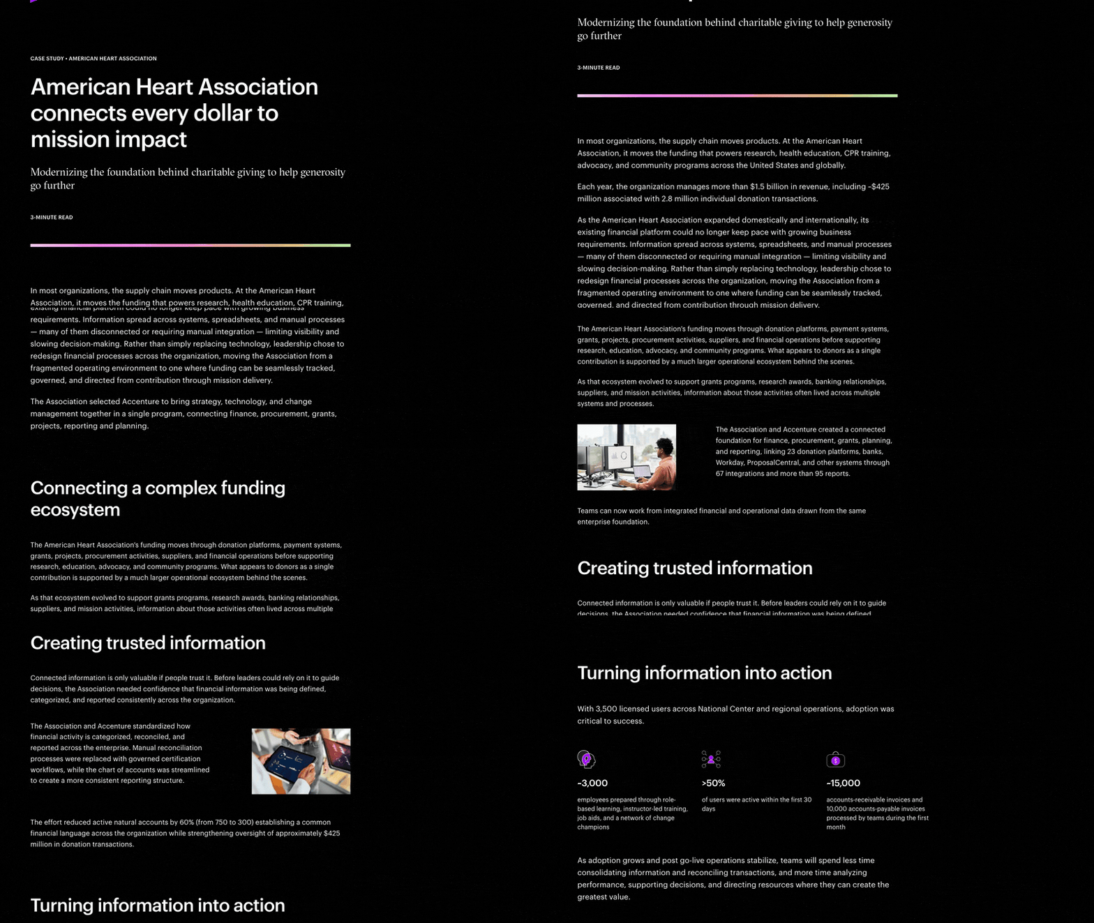
10. Accenture × American Heart Association
Visit site ↗What's on the page: A "3-minute read" on rebuilding the association's finance platform: 23 donation platforms, banks and other systems linked through 67 integrations, active natural accounts cut by 60% (750 to 300). Three stat blocks cover adoption. Cyndi Roberts, EVP and CFO, is quoted.
Worth copying: The reading time up top tells a busy buyer what it costs to read.
Watch out for: It ends on "Other Stories" with no contact button.
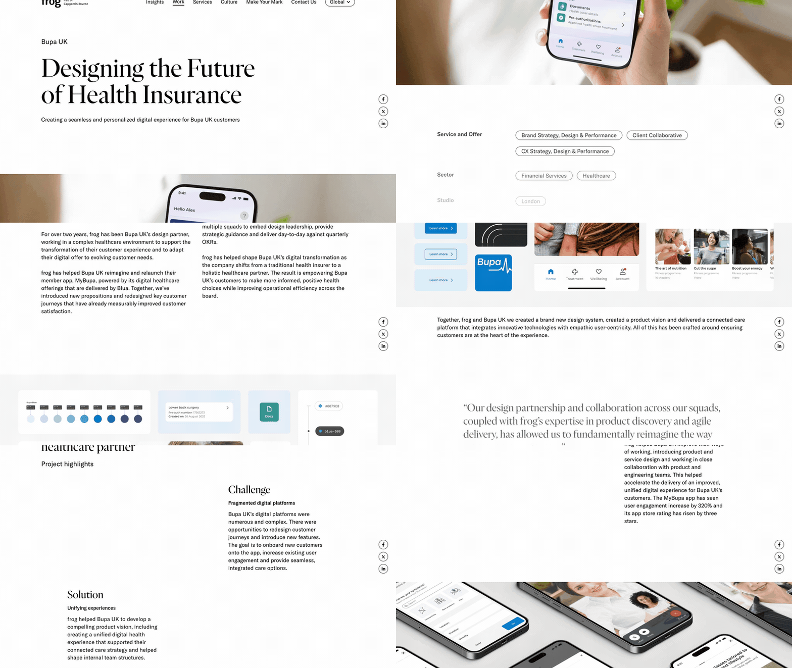
11. frog × Bupa UK
Visit site ↗What's on the page: frog, part of Capgemini Invent, on two-plus years of work on Bupa UK's MyBupa app. A "Project highlights" block puts Challenge, Solution and Outcome in three short cards before the full story. Results: engagement up 320%, app store rating from 1.6 to 4.6, then a quote from Francesca Aldred, Head of Digital Delivery.
Worth copying: A 20-second version sitting above the full version.
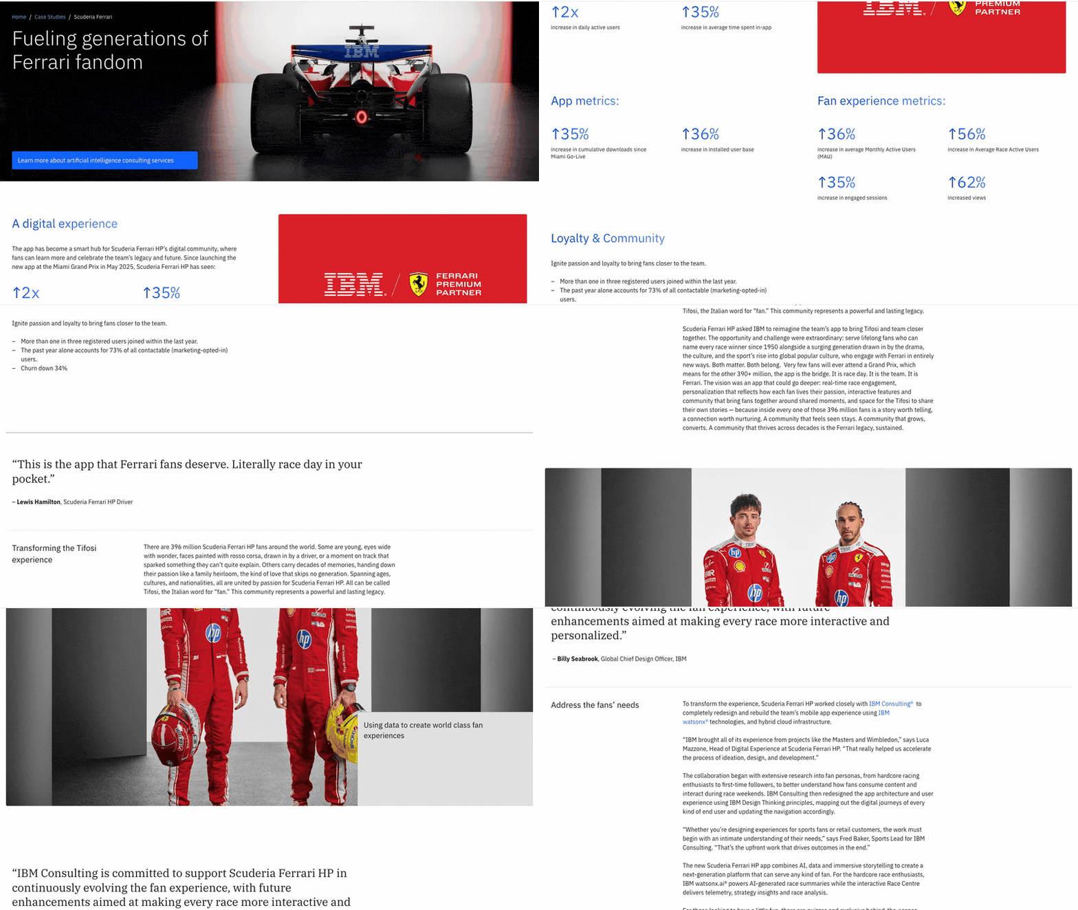
12. IBM Consulting × Scuderia Ferrari HP
Visit site ↗What's on the page: The rebuilt Ferrari fan app, launched at the Miami Grand Prix in May 2025. Metrics come in labeled groups: 2x daily active users, then app, fan experience and loyalty metrics, where churn is down 34%. Lewis Hamilton and Ferrari's head of digital experience are quoted.
Worth copying: Metrics grouped by theme, each group with a short label.
The structure: challenge, approach, numbers, quote, next step
Take the design away and the 12 pages share one skeleton.
| Part | What it answers | Keep it to | Seen in |
|---|---|---|---|
| Headline + results | What changed, for whom | 1 line, then 3 numbers | Shopify's 14% headline; Work & Co's Outcomes row |
| Challenge | What was broken and what it cost | 1 short paragraph | "Two years spent fixing, not building" (Shopify) |
| Approach | What you actually did | 3 or 4 steps | Fantasy's 4 objectives; Work & Co's 4 takeaways |
| Numbers | The before and after | 3 or 4 metrics, each with a baseline and a period | "4.8, up from 2.5"; "July to September 2026" |
| Quote | The client saying it | 1 or 2 sentences, name and title | Jesse Purewal at PagerDuty (Instrument) |
| Next step | What the reader does now | 1 button | "Start a Project" (Instrument); "Get in touch" (frog) |
Four rules the best of them follow:
- Results first. Stripe, Intercom, Work & Co and Shopify put their numbers above the story.
- Every number gets a baseline and a period. "4.8, up from 2.5" works. "16% more visit intent" leaves the reader guessing.
- Name the person you quote. An anonymous "client" quote reads as invented.
- End on one action. A call, a demo, a project form. Not a list of other stories.
The full checklist is in what to include in a case study, the writing process in how to write a case study, and more pages in case study examples.
PDF case study vs scroll page
Same content, two formats. The PDF is what most teams already have. The scroll page is what a buyer opens from a link on a phone.
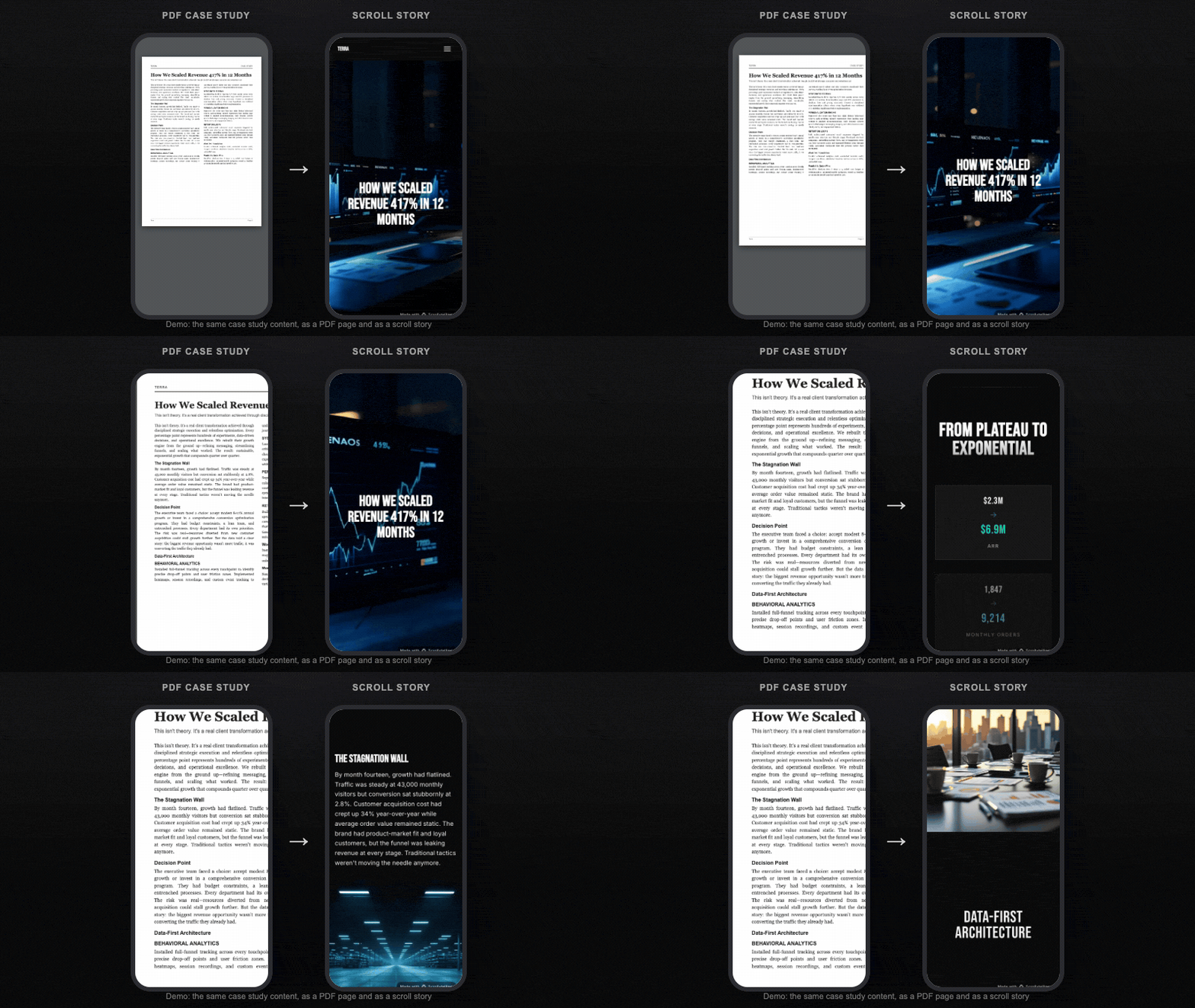
| PDF case study | Scroll page | |
|---|---|---|
| On a phone | Fixed page, zoom and pan | Reflows to the screen |
| Sharing | Attachment or download | A URL that opens in one tap |
| Changing a number | New file; old copies keep circulating | Edit once, every link updates |
| Knowing it was read | Usually not | Time on page, scroll depth |
| Procurement packs, print | Better: a fixed file | Not the job |
Keep the PDF if a procurement team asks for one. Send the page to everyone else.
Make one from your results or a URL
Three ways in, all ending in a page you can edit:
- From your results. In the case study maker, enter the client, the headline result, the challenge and a sentence about the work. After a free sign-up, the AI writes the page and generates a hero and images.
- From a URL or an old PDF. In the app, paste the link to an existing customer story, or upload the PDF case study, interview notes or a results spreadsheet (PDF, DOCX, TXT, MD, CSV, JSON, HTML). The generator restructures it into challenge, approach and results.
- From a template. The five case study templates are finished stories. Swap in your content.
Then change any word, image, color or section in the visual editor, no code. Widgets that suit a case study: a chart for the before and after, process steps for the approach, stacking cards for several results, split scroll to hold the client's photo beside the quote, and a scroll video opening.
Two things no tool supplies: the client's real numbers and their sign-off. Check every figure against the client's data, get the quote approved in writing, and read every AI-written claim before you publish.
Publish it on your own site
- A link. Every published story gets its own scrollytelling.ai address. The Free plan publishes one, with a small badge.
- Embed code. The Publish panel gives a responsive iframe snippet for any page builder or CMS block that accepts HTML.
- WordPress. The free WordPress plugin adds a block, a shortcode and auto-embed from a pasted link (step by step).
- Your own domain, on Pro. Add a CNAME record and the page runs on, say, customers.yourcompany.com, with SSL set up automatically.
- A ZIP, on every plan. A self-contained index.html with every image, video and font, to host anywhere.
Pricing as of November 2026: Free builds stories and publishes one. Pro starts at $12 a month with 250 credits and every feature; cancel any time, yearly billing available. Ceros, Shorthand, Storydoc and Visme also make interactive case studies; see Scrollytelling vs Storydoc, vs Shorthand and vs Ceros.
Frequently asked questions
What is an interactive case study?
A case study published as a web page instead of a PDF or slide. The reader scrolls through the challenge, approach and results, with large numbers, photos or video, and often motion tied to the scroll. It lives at a link you can send, embed or put on your own domain.
How long should a case study be?
Short enough to skim in 30 seconds and read in about 3 minutes; Accenture labels its American Heart Association case study a "3-minute read". That means a headline with the result, 3 or 4 numbers, a paragraph of challenge, 3 or 4 approach steps, one quote and one button.
Can I put it on our own website?
Yes. Paste the embed code (a responsive iframe) into any page builder that accepts HTML, use the free WordPress plugin, or publish on your own domain or subdomain on Pro. You can also download a self-contained ZIP on every plan and host it yourself.
How do I make one without a designer?
Enter the client, the headline result and the challenge in the free case study maker, or paste a URL or upload an old PDF case study in the app. The AI writes and designs a draft; you edit any word, image or color and publish. Free publishes one story; Pro starts at $12 a month.
Turn your client's results into a case study page
Paste the results or a link. Get an editable, scroll-driven page you can send, embed or put on your own domain. Free to build, no card.
Paste your results → Case study templates →