What makes a piece canonical
Most "best scrollytelling websites" lists are galleries of whatever looked good last quarter. This one is a history. A work earns a place here on one of two grounds: it was first at scale with a technique everyone later copied, or it moved that technique out of journalism and into ordinary commercial web design.
Study these seven and you have the whole vocabulary — pinned background, scrubbed sequence, chaptered video, stepper-driven chart, pinned product. Everything published since is a recombination. For the same vocabulary written as reusable rules rather than history, see scrollytelling design patterns; for the browser mechanics underneath, scroll-driven storytelling. For a gallery of current work, we keep 27 reviewed scrollytelling examples separately.
1. Snow Fall: The Avalanche at Tunnel Creek — The New York Times, 2012
The piece that named the genre. Snow Fall is John Branch's six-part reconstruction of the February 2012 avalanche at Tunnel Creek in Washington's Cascade Mountains, which killed three of the sixteen expert skiers and snowboarders on a backcountry run. It won the 2013 Pulitzer Prize for Feature Writing — the citation singled out "its deft integration of multimedia elements" — and a Peabody Award calling it "a spectacular realization of the potential of digital-age storytelling".
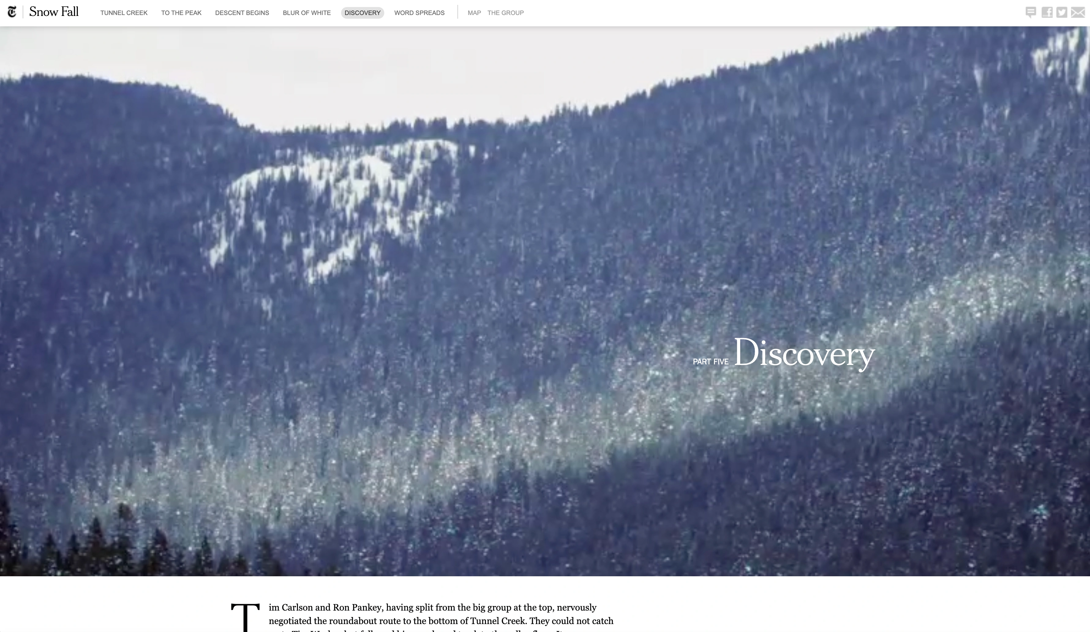
What it did technically. A graphics and design team of eleven assembled it over more than six months. Andrew Kueneman, then the Times' deputy director of digital design, led the digital design; Steve Duenes, the paper's graphics director, oversaw the graphics; graphics editor Jeremy White built a virtual terrain model from LIDAR elevation data and satellite imagery, which drove the flyover animations that put you on the mountain. The structural innovation was simpler and more influential: full-bleed media held in place while text moved over it, each chapter opening on a visual that behaved like a title card. Photographs, aerial video and simulations were part of the sentence flow, not sidebar furniture.
Why it mattered editorially. It proved a 2012 newsroom could publish a long reported feature as a designed object without the design eating the reporting. Within a year "can we snowfall this?" was newsroom shorthand — David Dowling and Travis Vogan took their Digital Journalism paper's title, Can We "Snowfall" This?, straight from the question. The idiom outlived the goodwill: by then "snowfalling" was as often a complaint about decoration bolted onto a thin story as a compliment.
Status, August 2026: live at its original URL and still running its six-part scroll. Read the original →
2. Firestorm: The story of the bushfire at Dunalley — The Guardian, 2013
Five months after Snow Fall, Firestorm answered it from the other side of the world. It follows the Holmes family, photographed sheltering under a jetty as the January 2013 bushfire took Dunalley, Tasmania. The page credits Jon Henley alongside Laurence Topham, Mustafa Khalili, Francesca Panetta and the Guardian Interactive team — a byline that is itself part of the story, because it puts video and interactive people on the masthead of a news feature.
What it did technically. Firestorm made video the spine rather than the garnish. Each chapter opens on full-width footage with ambient sound; scroll moves you between filmed testimony, stills and reported text, so a reader who scrolls slowly gets a documentary and one who scrolls fast gets an article. That chaptered structure — discrete acts, each with its own visual register — became the default architecture for the long-form web feature, and it is still what most agency and brand work imitates. Our page on hiring a scrollytelling agency versus building it yourself covers what that level of craft costs.
Status, August 2026: live at its original Guardian URL.
3. A Game of Shark and Minnow — The New York Times, 2013
2013 was the year every newsroom tried the form, and most attempts have not aged well. Two from the Times have: A Game of Shark and Minnow, Jeff Himmelman and Ashley Gilbertson's report from a grounded warship on Second Thomas Shoal in the South China Sea, and The Russia Left Behind, Ellen Barry's journey down the road from St Petersburg to Moscow.
What they did. Both bound the narrative to a map. In Shark and Minnow the geography is the argument: you cannot follow it without seeing where the shoal sits relative to everyone claiming it. The Russia Left Behind makes linear travel the scroll metaphor — down the page is down the highway. That is the rule underneath all good scrollytelling. The scrollbar should map onto something the story already has: time, distance, depth, a process. Map it onto nothing and you have decoration.
Status, August 2026: both live on nytimes.com at their original newsgraphics URLs.
4. The Boat — SBS, 2015
The best-loved piece in the canon, and the one that proved scrollytelling was not only a journalism format. The Boat adapts the title story from Nam Le's collection — sixteen-year-old Mai, put alone onto a refugee boat after the fall of Saigon — into what SBS released as an interactive graphic novel on 29 April 2015, timed to the fortieth anniversary. Artist Matt Huynh adapted and illustrated it; Kylie Boltin produced; Matt Smith did the design and development; Sam Petty did the sound.
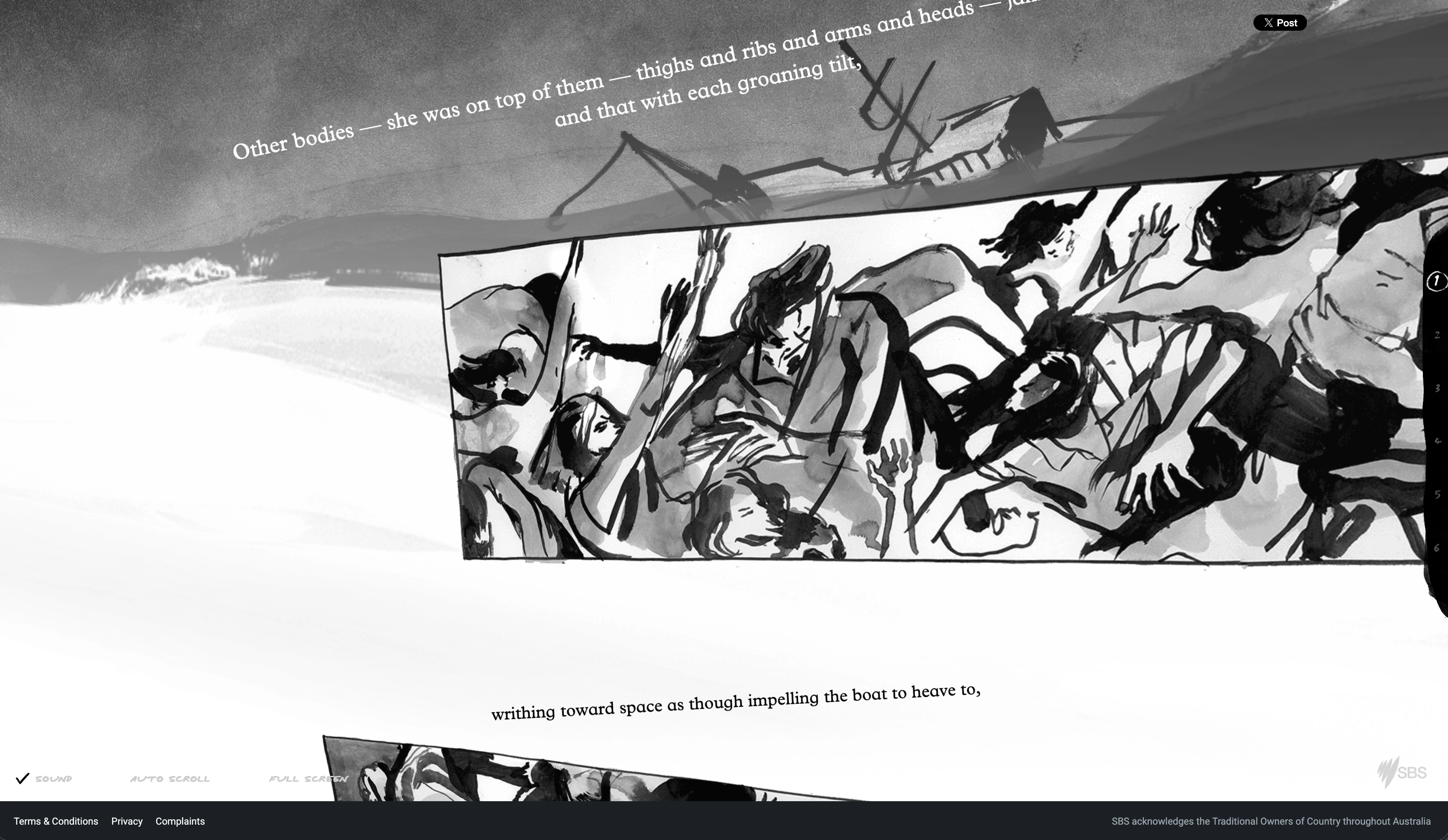
What it did technically. Huynh's own project notes put numbers on it: a 49-page short story rendered as 222 hand-painted illustrations, 59 animated sequences, 11 photographs and one video. Scroll drives the animation directly — brush strokes accumulate, water rises, the boat pitches — so the reader's pace becomes the story's pace. This is the scrubbed sequence: not a video you press play on, but a frame index bound to scroll offset. It is also the technique that transfers most cleanly to modern tooling.
Why it mattered. It won the World Illustration Awards 2016 (Editorial, Professional) and the Australian Interactive Media Industry Association Awards 2016 for Best Website or Online Service. More importantly it settled an argument: scroll could carry literary fiction, not just explainers, and the reader's hand on the trackpad could be part of the emotional design.
Status, August 2026: live at sbs.com.au/theboat/ and still running the original chapter navigation.
5. What's Really Warming the World? — Bloomberg, 2015
The canonical data piece, and the origin of the "scrolly science" style now standard in climate, epidemiology and economics explainers. Eric Roston and Blacki Migliozzi took NASA Goddard Institute for Space Studies model runs and walked readers through candidate causes of warming one at a time — orbital wobble, solar output, volcanoes, deforestation, aerosols, greenhouse gases — holding one chart in place while each hypothesis was drawn onto it and, in turn, failed to match the observed record. It took Bronze in Data Journalism at the Kantar Information is Beautiful Awards 2015.
What it did technically. One sticky graphic, many text steps, a chart that changes state as each step enters view. That is the whole pattern, and it remains the highest-value use of the technique because it solves a real problem: a chart with eight overlapping series is unreadable as a static image and trivially readable if you can show the series one at a time in a controlled order. It is the pattern most worth borrowing for business documents — see our data storytelling examples and the guide to making a data story.
Status, August 2026: Bloomberg serves it at bloomberg.com/graphics/2015-whats-warming-the-world/, but the site refused our automated check, so we cannot confirm its current state from here — the awards showcase above is the link we verified.
6. The Pudding — visual essays, 2017 onwards
The Pudding is a digital publication of visual essays explaining ideas debated in culture, founded in 2017 and funded by its sister visualisation studio, Polygraph, rather than by ads or subscriptions. It is not one famous piece; it is where the form became a working practice, made by a small collective in which the same person usually researches, designs, writes and codes an essay.
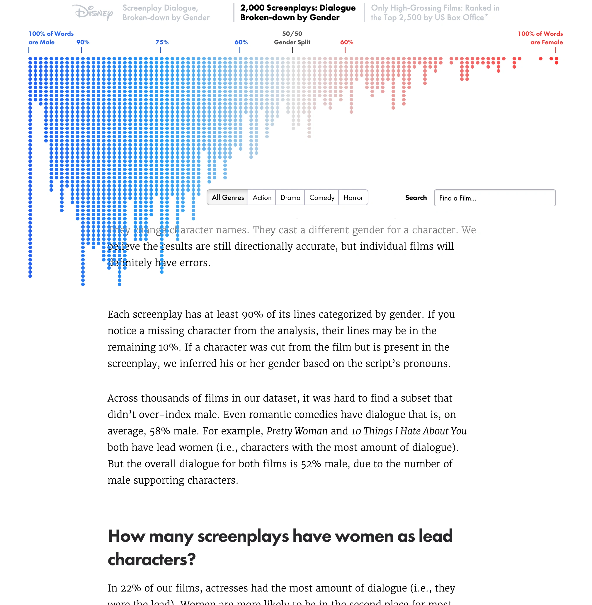
Two representative essays. "The Largest Ever Analysis of Film Dialogue by Gender" by Hanah Anderson and Matt Daniels (April 2016) parsed roughly 2,000 screenplays — 25,000 actors, four million lines — and lets you scroll the distribution film by film. "Women's Pockets are Inferior" by Jan Diehm and Amber Thomas (August 2018) is more instructive, because the data did not exist: they went into shops in Nashville, New York and Seattle and measured 80 pairs of jeans from 20 brands, all at a 32-inch waistband, finding women's pockets 48% shorter and 6.5% narrower than men's.
Why it mattered technically. The Pudding also built the plumbing. Its developer Russell Samora wrote Scrollama, which uses the browser's IntersectionObserver instead of listening to every scroll event, and the publication's 2017 comparison of six approaches to scrollytelling is still the most honest engineering write-up of the problem anywhere. If you have wondered why so many news graphics behave identically: a lot of them share one small open-source library out of one small publication.
Status, August 2026: live and publishing.
7. Apple product pages — the commercial mainstream
The most-seen scrollytelling in the world carries no byline and wins no journalism prizes. Apple has spent a decade making product pages where the product stays fixed in the viewport and scroll position decides what it does: rotate, explode into components, cut away to the driver assembly, change colour.
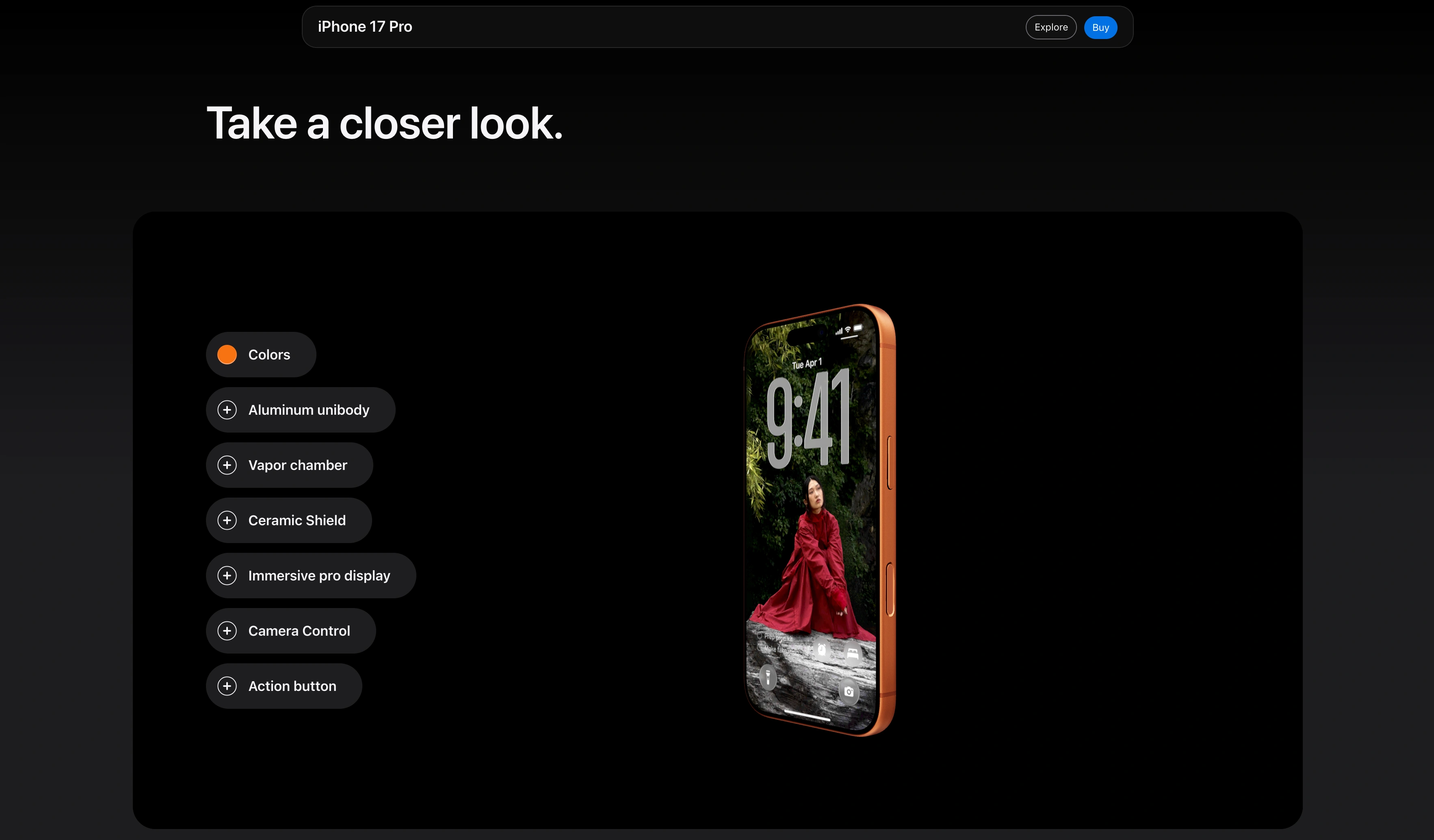
What it does technically. We read the markup. As of August 2026 the AirPods Pro page ships fifteen inline <video> elements and a component set Apple's own class names call scroll-gallery and scroll-group, with sections named scroll-item-driver and scroll-item-acoustics. Pinned media, scroll-indexed states, one idea per state — structurally identical to the Bloomberg chart, different subject matter.
Why it matters. Apple is why clients ask for this. It normalised the pinned-visual page for commerce, which is how the technique reached product launches, brand stories and interactive annual reports — and set the bar unhelpfully high, since almost nobody else ships bespoke video for a landing page.
Status, August 2026: live; Apple rebuilds these pages per product cycle, so specific URLs move.
The shape of the form, 2012 to now
Read in order, the canon has a clear arc. 2012–13 was the proof phase: newsrooms establishing that a scroll-driven feature could carry serious reporting, at enormous cost. 2015 was the range phase — The Boat carried fiction and hand-drawn art, Bloomberg carried an argument made entirely of data. 2016–18 was the practice phase, when The Pudding turned it into repeatable weekly craft and released the tooling. From roughly 2019 the technique left journalism for good, into product marketing, brand sites and reports.
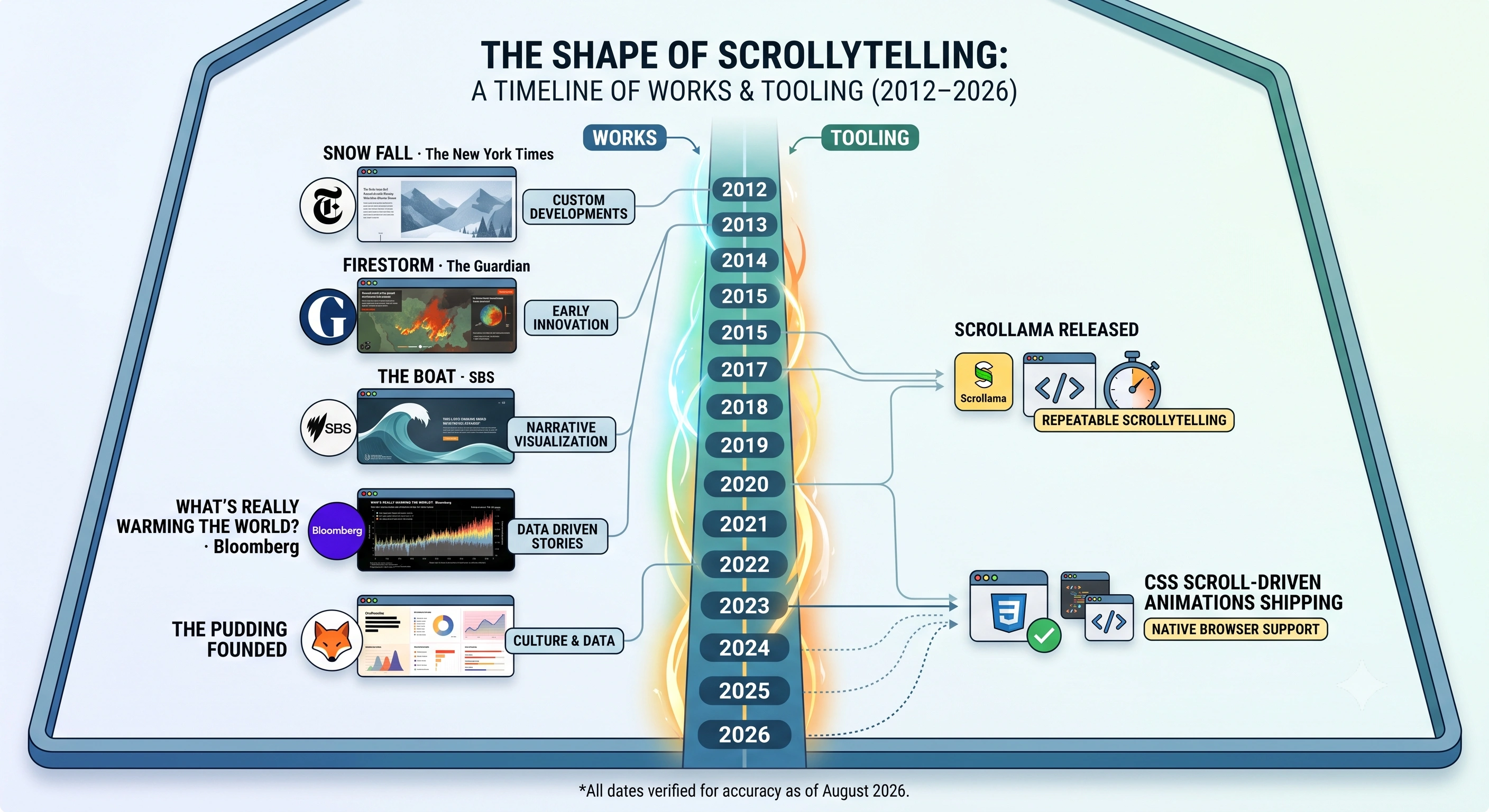
The technical arc explains why this got cheap. In 2012 a piece like Snow Fall meant hand-written scroll handlers and months of engineering. By 2017 IntersectionObserver had turned "tell me when this element is in view" into a browser primitive rather than a performance problem. Today the browser can drive an animation from scroll position with no JavaScript at all, via CSS scroll-driven animations. Bespoke code, shared library, platform feature — the normal life cycle of a web technique, and the reason the interesting question in 2026 is not how to build one but what is worth building.
What is still live, and what quietly died
We checked every original in this list in August 2026. The journalism has held up better than the software: Snow Fall, Firestorm, A Game of Shark and Minnow, The Russia Left Behind and The Boat all still resolve at their original URLs and still run their original interactions — remarkable for pages built with the JavaScript of 2012 to 2015.
The rot is elsewhere. Polygraph's original film-dialogue URL now returns a 404; the essay survives only because it was migrated to pudding.cool. Plenty of magazine and network interactives from the same era are gone entirely, taken out by CMS migrations rather than by any decision to unpublish. If a piece you remember has vanished, the Internet Archive is usually the only copy left, and archived scroll interactions frequently do not work.
The tools fared worse than the stories:
- Scroll Kit rebuilt Snow Fall in about an hour to show what a code-free editor could do, received a cease-and-desist from The New York Times and withdrew the demo. Automattic acquired the company in April 2014 and the editor was retired; founders Cody Brown and Kate Ray joined the WordPress.com team.
- Storehouse, the visual-story app that a lot of photographers built portfolios on, shut down on 15 July 2016; the team moved to Square, and users were given roughly a month to export.
- ScrollStory, often searched for as though it were a publication, is a jQuery plugin for building scroll-based stories — not a product or a work. Several similar-sounding names in search results are libraries or browser extensions rather than tools for making anything.
One practical conclusion: pick a tool whose output you can export and host on your own domain. Our roundup of scrollytelling tools and the Shorthand comparison both treat export and hosting as first-order questions for that reason.
What you can rebuild today, without code
Strip the canon down and there are four reusable mechanics. All four are now components you can configure in a browser:
- Pinned background, text over it (Snow Fall, Firestorm) — a full-bleed image or clip holds while the copy moves across it. This is the split-scroll pattern in its simplest form.
- Scroll-scrubbed sequence (The Boat, Apple) — a frame index bound to scroll offset, so the reader's pace is the playback rate. That is what the scroll video widget does: a clip is pre-rendered to a frame sequence and scrubbed on a canvas, which is smoother than trying to seek a video element.
- Sticky graphic, stepper text (Bloomberg, The Pudding) — one chart, many states, advanced by text steps entering the viewport.
- Chaptered cards (Firestorm's act structure) — discrete sections that stack and hand off, as in the stacking cards widget.
What none of this gives you is the part that made these works canonical. Snow Fall was months of Branch's reporting plus a graphics and design team of eleven. The Boat was 222 hand-painted panels. "Women's Pockets are Inferior" required someone to walk into shops with a tape measure, because the dataset did not exist. The format is commodity now; the material is not. If your scroll is bound to something the story genuinely has — a chronology, a route, a process, a set of measurements — the technique earns its keep. Bound to nothing, it is just a slow web page.
For a plain-language definition, start with what is scrollytelling. For the reporting and structure side of long-form features, see feature writing examples.
Frequently asked questions
What is the most famous scrollytelling piece?
"Snow Fall: The Avalanche at Tunnel Creek", published by The New York Times on 20 December 2012 and reported by John Branch. It won the 2013 Pulitzer Prize for Feature Writing and a Peabody Award, and it is the piece newsrooms named the genre after — "can we snowfall this?" became shorthand for a scroll-driven multimedia feature.
Is Snow Fall still online?
Yes. As of August 2026 it still resolves at nytimes.com/projects/2012/snow-fall/index.html and still runs its original six-part scroll experience. We checked the same way for The Guardian's Firestorm, The New York Times' A Game of Shark and Minnow and The Russia Left Behind, and SBS's The Boat — all five were live. The tools that promised to let everyone build pieces like them mostly are not.
What is The Pudding?
The Pudding is a digital publication of visual essays, founded in 2017, that explains ideas debated in culture through data and scroll-driven graphics. It runs without ads or a paywall, funded by its sister visualisation studio Polygraph. It is also where a lot of the form's public tooling came from: Pudding developer Russell Samora wrote Scrollama, the IntersectionObserver-based library many newsroom scrollytelling pieces still use.
Does Apple use scrollytelling?
Yes, and it is the reason most people have seen the technique without knowing its name. As of August 2026 Apple's AirPods Pro page ships fifteen inline video elements and a component set Apple's own markup calls scroll-gallery and scroll-group: the product is pinned in the viewport while scroll position drives which frame, angle or cutaway you see. That is the same sticky-visual, moving-text pattern the newsroom pieces invented, applied to selling hardware.
What happened to Storehouse, Scroll Kit and the other early scrollytelling tools?
They mostly closed. Scroll Kit rebuilt Snow Fall in about an hour to demonstrate its editor, received a cease-and-desist from The New York Times and pulled the demo; Automattic acquired the company in April 2014 and the editor was retired. Storehouse, the visual-story app, shut down on 15 July 2016 and its team moved to Square. The lesson is worth taking seriously: choose a tool whose output you can export and host yourself.
Can I make something like these without writing code?
The individual techniques, yes. A pinned background with text scrolling over it, a scroll-scrubbed image sequence, a sticky chart that changes state as text advances — all three are now standard components rather than bespoke engineering, and you can assemble them in a browser. What does not come from a tool is the six months of reporting, the 222 hand-painted panels or the original data analysis. The format is commodity now; the material is still the hard part.
Build your own, in the same vocabulary
Pinned visuals, scrubbed sequences, sticky charts — the mechanics the canon invented, ready to point at your own material.
Create your story → See 27 examples →