Three layers, not one
Most writing about scrollytelling design collapses three separate decisions into one word.
- Narrative structure — how much control the reader has over the order. A story decision, studied properly in the visualisation literature before scrollytelling existed.
- Display mechanism — what scrolling drives: a pinned graphic, a scrubbed image sequence, a chart that gains a series, a camera in a 3D scene.
- Trigger — how the browser decides a step has begun: an intersection threshold, a pixel offset, a scroll-progress timeline.
A piece can be author-driven in structure with no sticky graphics at all; another can pin a figure for eight steps and still leave the reader in charge. Conflating the layers is how "make it feel like Snow Fall" becomes a project nobody can scope. New to the form? Start with what scrollytelling is.
Narrative structures from the research
The vocabulary people reach for — "narrative visualization genre", "martini glass structure", "drill-down story", "author-driven versus reader-driven" — comes from one paper: Edward Segel and Jeffrey Heer, "Narrative Visualization: Telling Stories with Data", IEEE Transactions on Visualization and Computer Graphics 16(6), November/December 2010, pages 1139–1148 (Proc. InfoVis 2010). It is a design-space analysis of 58 examples from journalism, graphic design, comics, business, art and visualisation research. It predates Snow Fall (New York Times, December 2012), so it is not about scrollytelling — which is why it holds up.
Author-driven and reader-driven
Their Table 1 sets out a spectrum. A purely author-driven approach has a linear ordering of scenes, heavy messaging and no interactivity. A purely reader-driven approach has no prescribed ordering, no messaging and free interactivity. Film sits at one end, an analysis tool at the other, and almost nothing real sits at either extreme. Scrollytelling pushes a piece toward the author-driven end without abandoning interactivity: the scrollbar is the one control everybody knows, so the author imposes sequence while the reader keeps the pace.
The three hybrid structures
- Martini glass. Begins author-driven — questions, observations, an article — and once the intended narrative is complete it opens into a reader-driven stage of free exploration. The stem is the guided path; the widening mouth is the exploration. Segel and Heer report this was the most common structure across the interactive visualisations they examined, and it is still the safest default for a data-heavy piece: scroll the argument, land on an explorable chart.
- Interactive slideshow. A slideshow that incorporates interaction mid-narrative, within the confines of each slide. Modern scrollytelling is often exactly this, with scroll replacing the "next" button.
- Drill-down story. Presents a general theme and lets the reader choose instances of it to reveal details and back-stories. Leans reader-driven, and a poor fit for a linear scroll.
The paper also enumerates seven visual narrative genres: magazine style, annotated chart, partitioned poster, flow chart, comic strip, slide show, and film/video/animation. Scrollytelling did not add an eighth so much as fuse magazine style, annotated chart and slide show, and make the scrollbar the transition.
The six patterns
The display mechanisms that recur often enough to have stable names, each with the failure mode that shows up when it is used carelessly. For the code-level view see scroll-driven storytelling; for the canonical works these were extracted from, famous scrollytelling examples.
1. The sticky figure with stepped text
The defining scrollytelling layout. A graphic is pinned in the viewport while a column of short text blocks — the steps — scrolls past it, each step changing the graphic's state: a new year on a map, a new series on a chart, a new highlighted region. Side by side keeps figure and steps in separate columns and reads well on wide screens. Overlay makes the figure full-bleed with steps floating over it: more cinematic, and much more likely to end in unreadable text over a busy image.
The implementation is unglamorous, which is a good sign: pin the figure with position: sticky inside a tall container and let a step-trigger library say which step is active. The scrollama README is explicit — as of version 2.0.0 its own container callbacks were deprecated "in favor of CSS property position: sticky;".
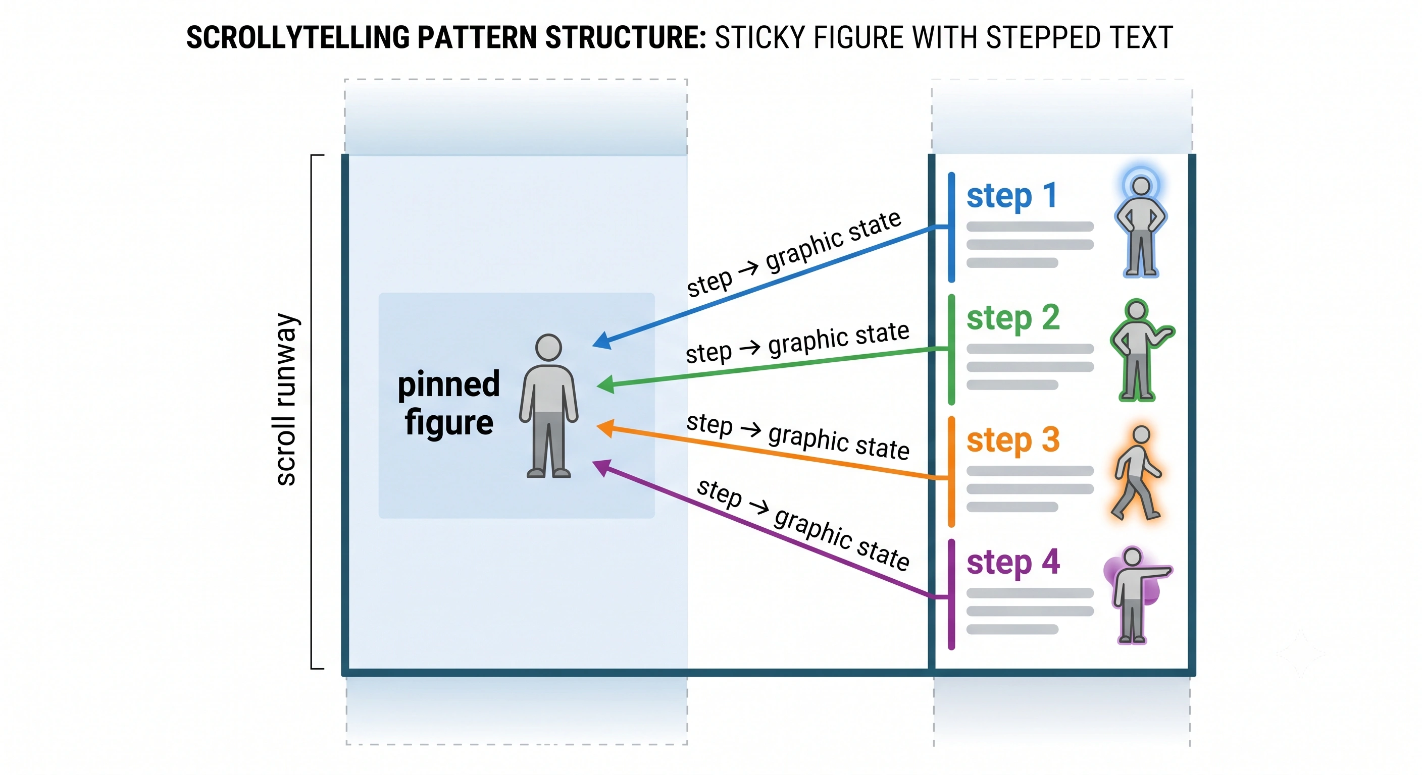
Failure mode: steps that do not earn their scroll. If three consecutive steps leave the figure unchanged, the reader is scrolling for nothing and starts skimming. One step, one visible change.
Try the shape: the split-scroll widget is this pattern as a copy-paste embed; the scroll-driven chart widget is the version where the pinned figure gains data as you go.
2. The scroll-scrubbed sequence
Instead of discrete states, the scrollbar maps continuously onto a sequence of frames: scroll down and the rocket assembles, the glacier retreats. Scroll up and it runs backwards — the property that makes it feel like a physical object rather than a video.
The naive implementation, a <video> element with currentTime set on every scroll event, is the most common cause of janky scrollytelling: browsers are not obliged to seek a compressed video instantly, and on mobile they frequently will not. Pre-render to a numbered image sequence and paint the right frame onto a canvas instead. That is what we do — each scroll video on Scrollytelling becomes up to 350 WebP frames at quality 90 and a maximum width of 1200 px, so scrubbing is just an image draw. Frame count is your fidelity knob and your bandwidth bill at once.
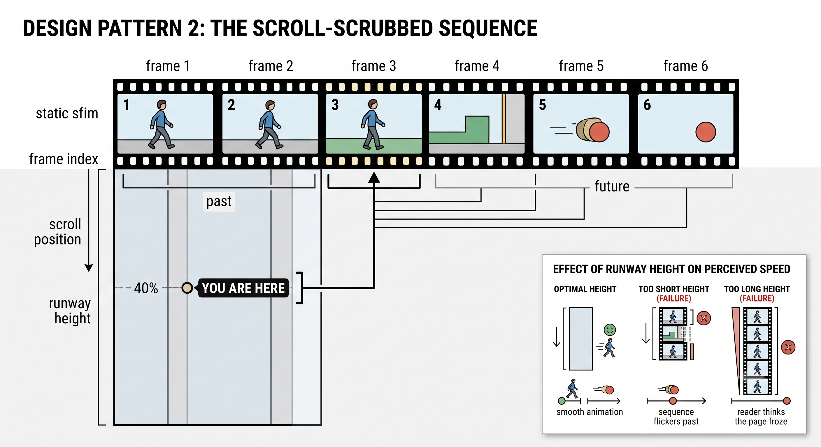
Failure mode: scrubbing something with no continuous story. A rotating logo is a screensaver. Scrub when the in-between states carry meaning — an assembly, a transformation, a journey.
Try the shape: the scroll-video widget renders and scrubs a frame sequence without the canvas code.
3. Step triggers, offsets and thresholds
Not a visual pattern, but the one that decides whether the visual patterns feel right. It answers a single question: at what point in the scroll does step 3 become active?
The modern answer is IntersectionObserver, not scroll listeners. MDN is direct about why: detecting visibility with getBoundingClientRect() in a scroll handler means "all this code runs on the main thread, even one of these can cause performance problems," whereas an observer lets "the browser [be] free to optimize the management of intersections as it sees fit." Scrollama (version 3.2.0 as of August 2026) wraps exactly this, and its defaults are informative: offset puts the trigger line halfway down the viewport (0.5), threshold sets progress granularity at 4 px, and progress is off, because most steps only need enter and exit. On touch devices switch offsets to pixels; scrollama ships a "mobile pattern" example for exactly this, using "pixels instead of percent for offset value so it doesn't jump around on scroll direction change".
The CSS-native alternative is worth knowing. The W3C Scroll-driven Animations specification defines scroll progress timelines (progress across a scroll container's range) and view progress timelines (progress as an element crosses the scrollport); MDN documents the CSS surface. These run off the main thread, which is the appeal. The catch is support: MDN's compatibility data lists animation-timeline as shipping in Chrome and Edge 115 and in Safari 26, with Firefox still preview-only as of August 2026. Use them as enhancement behind @supports.
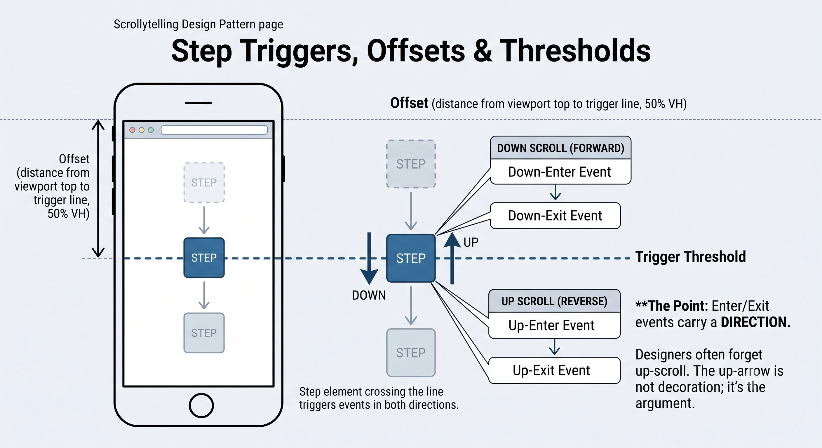
Failure mode: a step that only reads correctly downward. Every state change needs an inverse, or scrolling up leaves the figure contradicting the text.
4. Staged reveals
The cheapest useful pattern: content appears as it becomes relevant. A chart draws its baseline, then its trend line, then the annotation explaining the spike. Its value is not decoration, it is sequence of attention — a finished annotated chart shows nine things at once and lets the reader find the wrong one first. This is the pattern closest to Segel and Heer's interactive slideshow. Keep the motion small and fast: 150–250 ms, opacity and small transforms only, and always a defined end state that is correct if the animation never runs.
Failure mode: fade-in-on-scroll on every element. When everything animates, nothing is emphasised, and slower devices show a page that assembles itself late.
Try the shape: stacking cards are staged reveals with depth; how to make a data story covers which numbers deserve their own step.
5. Parallax
Background and foreground move at different speeds, producing an illusion of depth. Used once, at the top of a piece, to establish a place, it works. Used throughout, it has the worst ratio of effort to reader benefit on this list. It fights the scrollbar, because a page moving at a rate other than the gesture costs the reader their sense of control; it has nowhere to go on small screens; and it is a common motion-sickness trigger. WCAG 2.2's Success Criterion 2.3.3, Animation from Interactions (Level AAA) uses parallax as its worked example of "extra animations when the user scrolls", and requires that "motion animation triggered by interaction can be disabled, unless the animation is essential to the functionality or the information being conveyed."
Failure mode: parallax as the whole idea. Removing it almost never costs the reader information — which means it is decoration, which is fine, as long as it is cheap and off by default for anyone who asked for less motion.
6. The 3D or WebGL scene
Scroll drives a camera through a real 3D scene: around a product, through a building, out to the scale of a galaxy. Done well it is the most impressive thing on this list, and genuinely the right tool when the subject is spatial — you cannot explain the inside of an engine with a bar chart.
It is also the most expensive by a wide margin, in ways that are not obvious up front: asset production, a shader budget that has to hold on a mid-range phone, a designed loading state, a fallback for every device that cannot run it. Ask first whether a scrubbed sequence rendered from the same asset would carry the same meaning — usually it would, at a fraction of the runtime cost, because the reader is on a fixed path anyway. If the camera path is authored, pre-render it.
Failure mode: a five-second black screen before the scene appears. A 3D scroller with no designed loading state loses more readers than it impresses.
Pattern picker
Click a column header to sort. "Cost" is production effort, not licensing.
| Pattern | Use when | Structure it suits | Cost | Mobile risk | Reduced-motion fallback |
|---|---|---|---|---|---|
| Sticky figure | One subject, several observations about it | Interactive slideshow / martini glass | Low | Medium — needs a relayout | Stack figure above each step |
| Scrubbed sequence | Continuous change worth seeing in between | Author-driven | Medium | High — bandwidth and decode | Show 3–5 key frames as stills |
| Step triggers | Any stepped piece — this is plumbing | Any | Low | Medium — offsets must be pixels | Fire instantly, no transition |
| Staged reveal | Layered argument or annotated chart | Interactive slideshow | Very low | Low | Render the final state immediately |
| Parallax | One establishing scene, at most | Author-driven | Low | High — and a nausea risk | Disable entirely |
| 3D / WebGL | Spatial subject the reader must move around | Martini glass or drill-down | High | High — GPU and load time | Pre-rendered stills or a scrubbed sequence |
When scrollytelling is the wrong choice
The honest cases, from most to least common.
- The reader came to look something up. Reference content — pricing, specs, a policy, an API doc — should be scannable and searchable. Sequencing it costs time and gains nothing.
- The story is genuinely reader-driven. If the point is "find your own county, your own year, your own product", you want a drill-down and a good filter interface, not a sequence.
- The content changes weekly. Choreography is authored per step, so a frequently re-cut piece decays into steps that no longer match their figures.
- There is no argument. Scrollytelling reveals things in order because the order means something. Nine unrelated facts are better as a list.
- You cannot fund the mobile version. The one people skip. If the budget covers only desktop, do not start — most of the audience gets the broken half.
If it is the right choice but the build is the obstacle, the two routes are hiring or tooling: scrollytelling agencies versus doing it yourself weighs that trade-off, and the tools roundup covers what each platform can build.
Accessibility: the four things that actually matter
1. Honour reduced motion, and replace rather than delete. The prefers-reduced-motion media feature detects, in MDN's words, whether "a user has enabled a setting on their device to minimize the amount of non-essential motion". The lazy response is to disable transitions and ship a piece whose pinned figure now shows the wrong state. The correct one is a different layout: under reduce, unpin the figure, render each step's graphic state as a static image above its own text, and let it read as an illustrated article.
2. Keep the meaning in text. Every step's point must survive with the graphic switched off. A screen reader cannot see canvas state, and a fast scroller misses half the transitions anyway. If a step's insight exists only as a highlighted region on a map, that step is inaccessible — and badly written.
3. Never trap or hijack the scroll. Intercepting wheel and touch events to force a fixed animation duration ("scrolljacking") breaks the one contract the reader relies on, and it breaks keyboard scrolling: Space, Page Down and the arrow keys must move the page a normal amount and reach every step.
4. Do not steal focus on step entry. It confuses assistive technology and hijacks the caret for sighted keyboard users; use a polite live region if you must announce at all.
Performance budget
Scroll is the most latency-sensitive interaction on the web, because the finger and the pixels are supposed to move together.
- Observe, don't listen. IntersectionObserver over scroll handlers. If you must read scroll position continuously, do it inside
requestAnimationFrame, nevergetBoundingClientRect()per element per frame. - Animate compositor properties only —
transformandopacity. Animatingtop,heightormarginforces layout every frame. - Pay the image cost once. Modern formats sized to the largest rendering box and no larger, first frames preloaded, later ones fetched ahead of the playhead.
- Measure on a mid-range Android on cellular. Every scrollytelling performance problem is invisible on the developer's machine.
The mobile fallback, which is where most implementations fail
Mobile is not a smaller desktop for this form. A side-by-side sticky figure has no side, and parallax has no depth to reveal in 390 px.
The most quoted practical guidance is still Russell Samora's "Responsive Scrollytelling Best Practices" for The Pudding (April 2017), and its two central points have not aged. On viewport units: mobile browsers "toggle the top and bottom navbars' position and sizes whether you are scrolling up or down. This causes the viewport height to change, and will mess with your scroll triggers." Compute pixel heights from window.innerHeight instead of using vh. On the bigger decision — "keep it scrolly, or stack it" — keep the scroll experience only when transitions are "truly meaningful, and not just something to make it pop", and be shorter: "a few steps to grab the user and make your point and then you're out."
Two more from practice. Hover does not exist, so anything revealed on hover needs a tap equivalent. And design the stacked version deliberately rather than letting it fall out of the CSS — a large share of readers get that version.
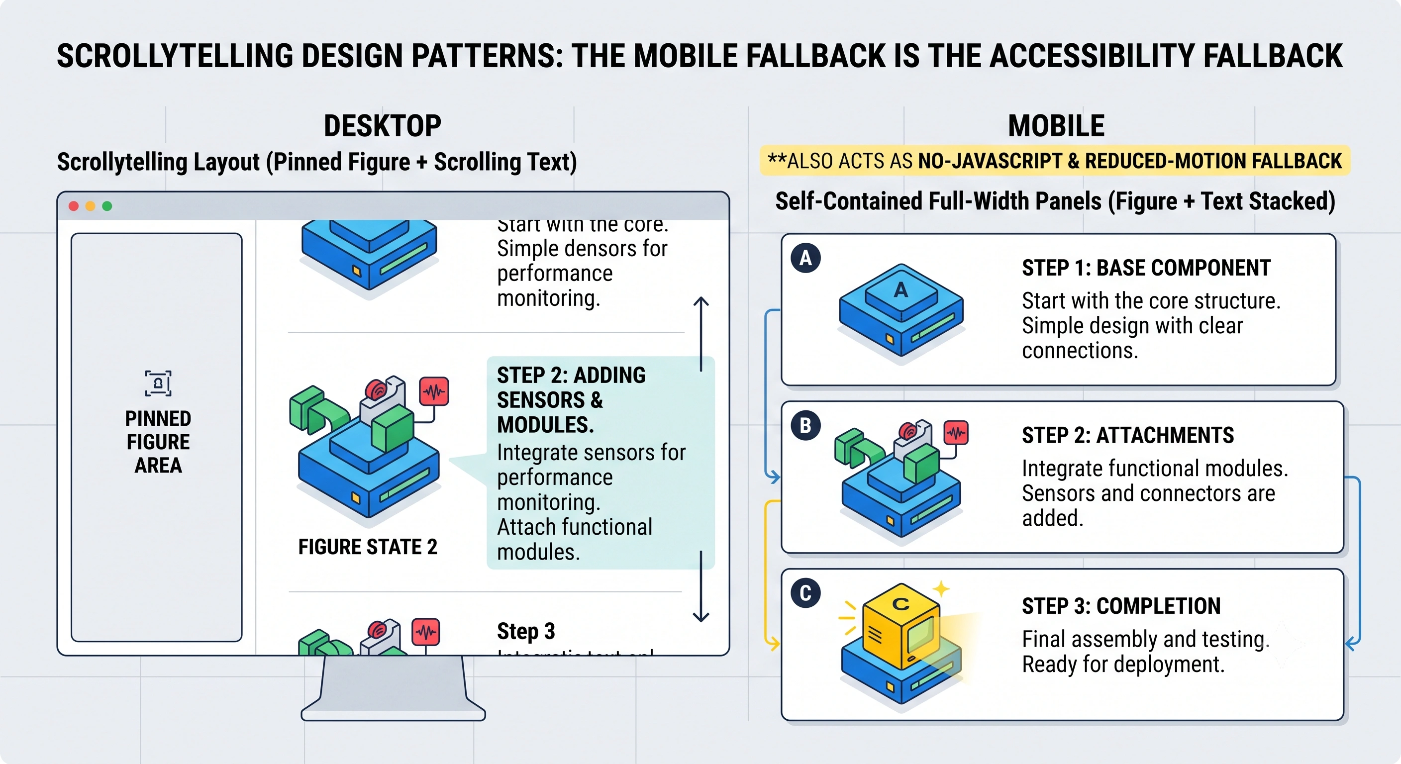
prefers-reduced-motion layout.Writing a scrollytelling prompt
If you are generating a first draft with AI, the prompt is where the pattern decisions get made. Name four things:
- The structure. "Guided the whole way", or "guided, then open into an explorable chart" (a martini glass), or "a hub with separate case studies" (a drill-down, which probably should not be a scroller).
- The mechanism, per section. "Section 2 pins the map and steps through four years. Section 3 is a plain staged reveal. No parallax anywhere." Naming the pattern is the highest-leverage sentence in the prompt.
- The evidence. Paste the real numbers, quotes and image sources. A model asked for a data story without data will invent plausible-looking numbers, which is the worst possible output.
- The constraints. Step count, reading time, the mobile version, the reduced-motion version.
Then edit: the draft's job is to get structure and step boundaries roughly right so your time goes to the sentences and the figures. Worked data-story examples are a good source of step boundaries to copy; if the output is a report rather than a feature, interactive annual report software covers that format's specifics.
Frequently asked questions
What are the main scrollytelling design patterns?
Six recur often enough to be worth naming: the sticky figure with stepped text, the scroll-scrubbed sequence, the step trigger with its offset and threshold, the staged reveal, parallax, and the 3D or WebGL scene. They sit on top of a narrative structure — how much control the reader has over the order — which is a separate decision.
What is the martini glass structure in narrative visualization?
One of three hybrid narrative structures named by Edward Segel and Jeffrey Heer in "Narrative Visualization: Telling Stories with Data" (IEEE Transactions on Visualization and Computer Graphics 16(6), 2010). A martini glass story begins author-driven — a prescribed path through questions, observations or an article — then opens into a reader-driven stage of free exploration. The stem is the guided narrative, the widening mouth the exploration. Segel and Heer report it was the most common structure across the interactive visualizations they examined.
What is the difference between author-driven and reader-driven?
Segel and Heer describe a spectrum. A purely author-driven piece has a linear ordering of scenes, heavy messaging and no interactivity; a purely reader-driven piece has no prescribed ordering, no messaging and free interactivity. Almost every real scrollytelling piece lands somewhere in between, and the interesting decision is where.
Is scrollytelling bad for accessibility?
Only when it is built badly, which is common. Three fixes matter most: honour prefers-reduced-motion by shipping a static stacked version rather than a broken one; keep every step's meaning in real DOM text so screen-reader and keyboard users get the whole story; and never intercept wheel or touch events to control scroll speed. WCAG 2.2 Success Criterion 2.3.3, Animation from Interactions (Level AAA), requires that motion animation triggered by interaction can be disabled unless it is essential.
How should scrollytelling work on mobile?
Design it as a real layout, not a squeezed desktop one: side-by-side sticky figures become stacked panels and the step count comes down. Avoid vh units for step heights — Russell Samora's 2017 Pudding write-up notes that mobile browsers change viewport height as their toolbars hide and show, which breaks scroll triggers — and compute pixel values from window.innerHeight instead.
What should a scrollytelling prompt include?
Name the structure, the mechanism and the evidence: whether the piece is guided end to end or opens up for exploration; which sections need a pinned figure, a scrubbed sequence or a plain staged reveal; and the real numbers, quotes and images rather than asking for them to be invented. Then the constraints — step count, the mobile version, the reduced-motion version.
Build one without writing the plumbing
Sticky figures, scrubbed sequences and staged reveals as authored blocks — with the stacked mobile and reduced-motion versions generated alongside them.
Create a story → Browse the widgets →